Runs/circle · chain · relay/036
circle · chain · relay · step 036 of 64
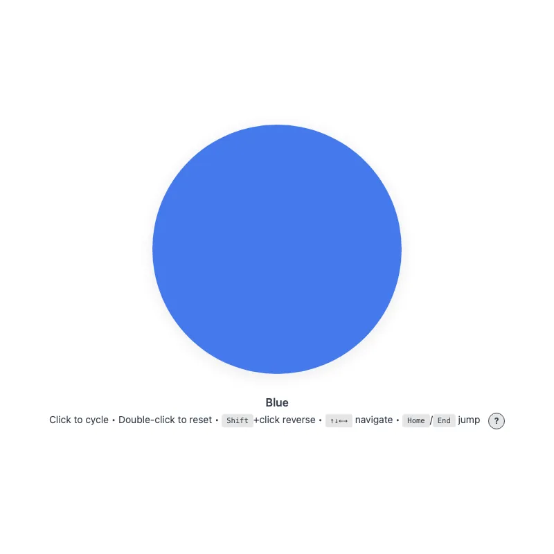
offline render, Chrome 154, light scheme, 2 s of virtual time
runs in a sandboxed frame with no origin; live pages may fetch CDN fonts the offline render did not
<!DOCTYPE html>
<html lang="en">
<head>
  <meta charset="UTF-8">
  <meta name="viewport" content="width=device-width, initial-scale=1.0">
  <meta name="color-scheme" content="light dark">
  <title>Animated Circle - Interactive Demo</title>
  <meta name="description" content="A responsive, accessible circle that changes color when clicked">
  <meta name="theme-color" content="#ffffff" media="(prefers-color-scheme: light)">
  <meta name="theme-color" content="#111111" media="(prefers-color-scheme: dark)">
  <link rel="icon" href="data:,">
  <style>
    *,
    *::before,
    *::after {
      box-sizing: border-box;
      margin: 0;
      padding: 0;
    }
    :root {
      color-scheme: light dark;
      --bg: #fff;
      --text: #374151;
      --fg: #2563eb;
      --shadow: rgba(0, 0, 0, 0.1);
      --kbd-bg: rgba(0, 0, 0, 0.1);
      --drop: drop-shadow(0 4px 12px var(--shadow));
    }
    [data-color="red"] { --fg: #dc2626; }
    [data-color="green"] { --fg: #16a34a; }
    [data-color="amber"] { --fg: #d97706; }
    [data-color="violet"] { --fg: #7c3aed; }
    [data-color="cyan"] { --fg: #0891b2; }
    @media (prefers-color-scheme: dark) {
      :root {
        --bg: #111;
        --text: #d1d5db;
        --fg: #93c5fd;
        --shadow: rgba(0, 0, 0, 0.6);
        --kbd-bg: rgba(255, 255, 255, 0.15);
      }
      [data-color="red"] { --fg: #fca5a5; }
      [data-color="green"] { --fg: #86efac; }
      [data-color="amber"] { --fg: #fcd34d; }
      [data-color="violet"] { --fg: #c4b5fd; }
      [data-color="cyan"] { --fg: #67e8f9; }
    }
    @media (prefers-contrast: more) {
      :root {
        --shadow: rgba(0, 0, 0, 0.9);
        --drop: drop-shadow(0 2px 8px var(--shadow));
      }
      .circle svg {
        opacity: 1;
      }
    }
    @media (forced-colors: active) {
      svg circle {
        stroke: CanvasText;
        stroke-width: 2;
      }
    }
    body {
      min-height: 100vh;
      min-height: 100dvh;
      display: grid;
      place-items: center;
      padding: 1rem;
      background: var(--bg);
      color: var(--text);
      font-family: system-ui, -apple-system, sans-serif;
    }
    main {
      width: 100%;
      display: flex;
      flex-direction: column;
      align-items: center;
      text-align: center;
    }
    .circle {
      display: block;
      width: min(360px, 100%, 60vh);
      aspect-ratio: 1;
      border: 0;
      border-radius: 50%;
      background: none;
      color: var(--fg);
      cursor: pointer;
      touch-action: manipulation;
      -webkit-tap-highlight-color: transparent;
      /* Shift+click and double-click would otherwise select the text below */
      -webkit-user-select: none;
      user-select: none;
      transition: color 0.4s ease;
      min-height: 48px;
      min-width: 48px;
    }
    .no-transition,
    .no-transition svg {
      transition: none !important;
    }
    .circle:focus-visible {
      outline: 3px solid currentColor;
      /* Must clear the scaled-up circle (up to 9px) or the ring merges with it */
      outline-offset: 12px;
    }
    svg {
      display: block;
      width: 100%;
      height: 100%;
      overflow: visible;
      opacity: 0.85;
      filter: var(--drop);
      transition: opacity 0.3s ease;
    }
    .circle:active svg,
    .circle:focus-visible svg {
      opacity: 1;
    }
    @keyframes pulse {
      0% {
        filter: var(--drop) drop-shadow(0 0 16px currentColor);
      }
      100% {
        filter: var(--drop) drop-shadow(0 0 0 transparent);
      }
    }
    @media (hover: hover) {
      .circle:hover svg {
        opacity: 1;
      }
    }
    @media (prefers-reduced-motion: no-preference) {
      svg {
        transition:
          transform 0.3s cubic-bezier(0.34, 1.56, 0.64, 1),
          opacity 0.3s ease;
      }
      .circle:focus-visible svg {
        transform: scale(1.05);
      }
      .circle:active svg {
        transform: scale(0.97);
      }
      .circle.color-changed svg {
        animation: pulse 0.5s ease-out;
      }
    }
    @media (hover: hover) and (prefers-reduced-motion: no-preference) {
      .circle:hover:not(:active) svg {
        transform: scale(1.05);
      }
    }
    .visually-hidden {
      position: absolute;
      width: 1px;
      height: 1px;
      overflow: hidden;
      clip-path: inset(50%);
      white-space: nowrap;
    }
    .status {
      margin-top: 2rem;
      font-weight: 600;
    }
    .hint {
      margin-top: 0.25rem;
      font-size: 0.875rem;
      line-height: 1.75;
    }
    .help-button {
      margin-left: 0.5rem;
      display: inline-block;
      width: 1.5rem;
      height: 1.5rem;
      border-radius: 50%;
      background: var(--kbd-bg);
      border: 1px solid var(--text);
      color: var(--text);
      cursor: pointer;
      font: inherit;
      font-size: 0.75rem;
      font-weight: bold;
      line-height: 1;
      text-align: center;
      vertical-align: middle;
      touch-action: manipulation;
      transition: background-color 0.2s ease, color 0.2s ease;
    }
    .help-button:focus-visible {
      outline: 2px solid currentColor;
      outline-offset: 2px;
    }
    @media (hover: hover) {
      /* Not currentColor: it would resolve to the hover color and hide the "?" */
      .help-button:hover {
        background: var(--text);
        color: var(--bg);
      }
    }
    .keys {
      display: none;
    }
    .keys.visible {
      display: inline;
    }
    @media (hover: none) and (pointer: coarse) {
      .hint .keys {
        display: none !important;
      }
      .help-button {
        display: none;
      }
    }
    kbd {
      display: inline-block;
      padding: 0.125rem 0.375rem;
      background: var(--kbd-bg);
      border: 1px solid transparent;
      border-radius: 0.25rem;
      font-family: monospace;
      font-size: 0.75em;
      line-height: 1.2;
    }
  </style>
</head>
<body>
  <main>
    <h1 class="visually-hidden">Animated Circle</h1>
    <button type="button" class="circle no-transition" aria-label="Change circle color" aria-describedby="status hint">
      <svg viewBox="0 0 100 100" aria-hidden="true" focusable="false" xmlns="http://www.w3.org/2000/svg">
        <circle cx="50" cy="50" r="50" fill="currentColor"/>
      </svg>
    </button>
    <p class="status" id="status" role="status">Blue</p>
    <p class="hint"><span id="hint"><span class="verb">Click</span> to cycle • <span class="double-verb">Double-click</span> to reset<span class="keys" id="keys"> • <kbd>Shift</kbd>+click reverse • <kbd>↑↓←→</kbd> navigate • <kbd>Home</kbd>/<kbd>End</kbd> jump</span></span> <button type="button" class="help-button" aria-label="Keyboard shortcuts" aria-expanded="false" aria-controls="keys"><span aria-hidden="true">?</span></button></p>
  </main>
  <script>
    const config = {
      colors: ['blue', 'red', 'green', 'amber', 'violet', 'cyan'],
      storageKey: 'circle-color',
      hapticDuration: 50,
      keySteps: { ArrowRight: 1, ArrowDown: 1, ArrowLeft: -1, ArrowUp: -1 },
    };

    const DOM = {
      button: document.querySelector('.circle'),
      status: document.querySelector('.status'),
      helpButton: document.querySelector('.help-button'),
      keyHint: document.querySelector('.keys'),
      verbSpan: document.querySelector('.hint .verb'),
      doubleVerbSpan: document.querySelector('.hint .double-verb'),
    };

    const state = {
      index: 0,
      shiftHeld: false,
      hoverCapable: !matchMedia('(hover: none)').matches,
      reducedMotion: matchMedia('(prefers-reduced-motion: reduce)'),
      hoverQuery: matchMedia('(hover: none)'),
    };

    function loadColor() {
      try {
        return localStorage.getItem(config.storageKey);
      } catch {
        return null;
      }
    }

    function saveColor(color) {
      try {
        localStorage.setItem(config.storageKey, color);
      } catch {}
    }

    function applyColor() {
      const color = config.colors[state.index];
      DOM.button.dataset.color = color === 'blue' ? '' : color;
      DOM.status.textContent = color[0].toUpperCase() + color.slice(1);
    }

    function setIndex(next, { haptic = false } = {}) {
      if (next === state.index) return;
      state.index = next;
      applyColor();
      saveColor(config.colors[state.index]);

      if (haptic && navigator.vibrate) navigator.vibrate(config.hapticDuration);

      if (state.reducedMotion.matches) return;
      DOM.button.classList.remove('color-changed');
      void DOM.button.offsetWidth;
      DOM.button.classList.add('color-changed');
    }

    function changeColor(step) {
      setIndex((state.index + step + config.colors.length) % config.colors.length, { haptic: true });
    }

    function updateDeviceVerbs() {
      state.hoverCapable = !state.hoverQuery.matches;
      DOM.verbSpan.textContent = state.hoverCapable ? 'Click' : 'Tap';
      DOM.doubleVerbSpan.textContent = state.hoverCapable ? 'Double-click' : 'Double-tap';
    }

    function toggleKeyHintVisibility() {
      const expanded = DOM.keyHint.classList.toggle('visible');
      DOM.helpButton.setAttribute('aria-expanded', expanded);
    }

    function handleKeyDown(event) {
      if (event.key === 'Enter' || event.key === ' ') {
        if (!event.repeat) state.shiftHeld = event.shiftKey;
        if (event.key === 'Enter' && event.repeat) event.preventDefault();
        return;
      }

      if (event.altKey || event.ctrlKey || event.metaKey) return;

      if (event.key in config.keySteps) {
        event.preventDefault();
        changeColor(config.keySteps[event.key]);
      } else if (event.key === 'Home') {
        event.preventDefault();
        setIndex(0, { haptic: true });
      } else if (event.key === 'End') {
        event.preventDefault();
        setIndex(config.colors.length - 1, { haptic: true });
      }
    }

    // Initialize
    const savedColor = loadColor();
    state.index = config.colors.includes(savedColor) ? config.colors.indexOf(savedColor) : 0;
    applyColor();

    requestAnimationFrame(() => requestAnimationFrame(() => {
      DOM.button.classList.remove('no-transition');
    }));

    updateDeviceVerbs();
    state.hoverQuery.addEventListener('change', updateDeviceVerbs);

    if (state.hoverCapable) {
      DOM.keyHint.classList.add('visible');
      DOM.helpButton.setAttribute('aria-expanded', 'true');
    }

    // Event listeners
    DOM.button.addEventListener('keydown', handleKeyDown);
    DOM.button.addEventListener('keyup', (event) => {
      if (event.key === ' ') state.shiftHeld = event.shiftKey;
    });
    DOM.button.addEventListener('blur', () => {
      state.shiftHeld = false;
    });
    DOM.button.addEventListener('click', (event) => {
      if (event.detail > 1) return;
      changeColor(event.shiftKey || state.shiftHeld ? -1 : 1);
      state.shiftHeld = false;
    });
    DOM.button.addEventListener('dblclick', (event) => {
      event.preventDefault();
      setIndex(0);
    });
    DOM.button.addEventListener('animationend', () => {
      DOM.button.classList.remove('color-changed');
    });

    DOM.helpButton.addEventListener('click', toggleKeyHintVisibility);

    addEventListener('storage', (event) => {
      if (event.key !== config.storageKey && event.key !== null) return;
      const newIndex = config.colors.indexOf(event.newValue);
      state.index = newIndex === -1 ? 0 : newIndex;
      applyColor();
    });
  </script>
</body>
</html>
what changed from step 035
+92 / -101 lines
</main> <script>- const button = document.querySelector('.circle');- const status = document.querySelector('.status');- const helpButton = document.querySelector('.help-button');- const keyHint = document.querySelector('.keys');- const colors = ['blue', 'red', 'green', 'amber', 'violet', 'cyan'];- const storageKey = 'circle-color';- const reducedMotion = matchMedia('(prefers-reduced-motion: reduce)');+ const config = {+ colors: ['blue', 'red', 'green', 'amber', 'violet', 'cyan'],+ storageKey: 'circle-color',+ hapticDuration: 50,+ keySteps: { ArrowRight: 1, ArrowDown: 1, ArrowLeft: -1, ArrowUp: -1 },+ }; - // Safely retrieve saved color from localStorage, returning null if unavailable+ const DOM = {+ button: document.querySelector('.circle'),+ status: document.querySelector('.status'),+ helpButton: document.querySelector('.help-button'),+ keyHint: document.querySelector('.keys'),+ verbSpan: document.querySelector('.hint .verb'),+ doubleVerbSpan: document.querySelector('.hint .double-verb'),+ };+ + const state = {+ index: 0,+ shiftHeld: false,+ hoverCapable: !matchMedia('(hover: none)').matches,+ reducedMotion: matchMedia('(prefers-reduced-motion: reduce)'),+ hoverQuery: matchMedia('(hover: none)'),+ };+ function loadColor() { try {- return localStorage.getItem(storageKey);+ return localStorage.getItem(config.storageKey); } catch { return null;⋯ line 269 } - // Safely save color to localStorage, silently failing if unavailable function saveColor(color) { try {- localStorage.setItem(storageKey, color);+ localStorage.setItem(config.storageKey, color); } catch {} } - const savedColor = loadColor();- let index = colors.includes(savedColor) ? colors.indexOf(savedColor) : 0;- - // Apply current color to button and update status display function applyColor() {- const color = colors[index];- if (color === 'blue') {- delete button.dataset.color;- } else {- button.dataset.color = color;- }- // The status live region announces the change; the button's label stays- // fixed so screen readers don't read the color twice- status.textContent = color[0].toUpperCase() + color.slice(1);+ const color = config.colors[state.index];+ DOM.button.dataset.color = color === 'blue' ? '' : color;+ DOM.status.textContent = color[0].toUpperCase() + color.slice(1); } - // Switch to the color at the given index, persist it and trigger pulse animation function setIndex(next, { haptic = false } = {}) {- // Home/End at the boundary shouldn't pulse or rewrite storage- if (next === index) return;- index = next;+ if (next === state.index) return;+ state.index = next; applyColor();- saveColor(colors[index]);+ saveColor(config.colors[state.index]); - // Haptic feedback for supported devices- if (haptic && navigator.vibrate) navigator.vibrate(50);+ if (haptic && navigator.vibrate) navigator.vibrate(config.hapticDuration); - // With reduced motion no animation runs, so animationend would never clear the class- if (reducedMotion.matches) return;- button.classList.remove('color-changed');- void button.offsetWidth;- button.classList.add('color-changed');+ if (state.reducedMotion.matches) return;+ DOM.button.classList.remove('color-changed');+ void DOM.button.offsetWidth;+ DOM.button.classList.add('color-changed'); } - // Cycle color by step amount function changeColor(step) {- setIndex((index + step + colors.length) % colors.length, { haptic: true });+ setIndex((state.index + step + config.colors.length) % config.colors.length, { haptic: true }); } - applyColor();- // Double rAF ensures paint completes before enabling animations- requestAnimationFrame(() => requestAnimationFrame(() => {- button.classList.remove('no-transition');- }));+ function updateDeviceVerbs() {+ state.hoverCapable = !state.hoverQuery.matches;+ DOM.verbSpan.textContent = state.hoverCapable ? 'Click' : 'Tap';+ DOM.doubleVerbSpan.textContent = state.hoverCapable ? 'Double-click' : 'Double-tap';+ } - // Update instructions to show "Tap" on touch devices or "Click" on hover-capable devices- const hoverQuery = matchMedia('(hover: none)');- const verbSpan = document.querySelector('.hint .verb');- const doubleVerbSpan = document.querySelector('.hint .double-verb');- function updateVerb() {- verbSpan.textContent = hoverQuery.matches ? 'Tap' : 'Click';- doubleVerbSpan.textContent = hoverQuery.matches ? 'Double-tap' : 'Double-click';+ function toggleKeyHintVisibility() {+ const expanded = DOM.keyHint.classList.toggle('visible');+ DOM.helpButton.setAttribute('aria-expanded', expanded); }- updateVerb();- hoverQuery.addEventListener('change', updateVerb); - // Space and Enter activate through the native click, but keyboard-synthesized- // clicks don't reliably carry shiftKey, so remember it from the key events- let shiftHeld = false;- const isActivationKey = (event) => event.key === 'Enter' || event.key === ' ';- // Space clicks on keyup; Enter already clicked on keydown, so updating- // shiftHeld on Enter's keyup would leak into the next mouse click- button.addEventListener('keyup', (event) => {- if (event.key === ' ') shiftHeld = event.shiftKey;- });- button.addEventListener('blur', () => {- shiftHeld = false;- });- - const keySteps = { ArrowRight: 1, ArrowDown: 1, ArrowLeft: -1, ArrowUp: -1 };- button.addEventListener('keydown', (event) => {- if (isActivationKey(event)) {- // Holding Enter would otherwise fire a click on every repeat; no click- // follows to reset shiftHeld, so setting it here would leak into the- // next mouse click- if (event.repeat) {- if (event.key === 'Enter') event.preventDefault();- return;- }- shiftHeld = event.shiftKey;+ function handleKeyDown(event) {+ if (event.key === 'Enter' || event.key === ' ') {+ if (!event.repeat) state.shiftHeld = event.shiftKey;+ if (event.key === 'Enter' && event.repeat) event.preventDefault(); return; }+ if (event.altKey || event.ctrlKey || event.metaKey) return;- if (event.key in keySteps) {+ + if (event.key in config.keySteps) { event.preventDefault();- changeColor(keySteps[event.key]);+ changeColor(config.keySteps[event.key]); } else if (event.key === 'Home') { event.preventDefault();⋯ line 327 } else if (event.key === 'End') { event.preventDefault();- setIndex(colors.length - 1, { haptic: true });+ setIndex(config.colors.length - 1, { haptic: true }); }+ }+ + // Initialize+ const savedColor = loadColor();+ state.index = config.colors.includes(savedColor) ? config.colors.indexOf(savedColor) : 0;+ applyColor();+ + requestAnimationFrame(() => requestAnimationFrame(() => {+ DOM.button.classList.remove('no-transition');+ }));+ + updateDeviceVerbs();+ state.hoverQuery.addEventListener('change', updateDeviceVerbs);+ + if (state.hoverCapable) {+ DOM.keyHint.classList.add('visible');+ DOM.helpButton.setAttribute('aria-expanded', 'true');+ }+ + // Event listeners+ DOM.button.addEventListener('keydown', handleKeyDown);+ DOM.button.addEventListener('keyup', (event) => {+ if (event.key === ' ') state.shiftHeld = event.shiftKey; });- button.addEventListener('click', (event) => {- // event.detail is 2+ for clicks that are part of a dblclick; skip them- // so double-click resets cleanly instead of cycling twice then resetting+ DOM.button.addEventListener('blur', () => {+ state.shiftHeld = false;+ });+ DOM.button.addEventListener('click', (event) => { if (event.detail > 1) return;- changeColor(event.shiftKey || shiftHeld ? -1 : 1);- shiftHeld = false;+ changeColor(event.shiftKey || state.shiftHeld ? -1 : 1);+ state.shiftHeld = false; });- button.addEventListener('animationend', () => {- button.classList.remove('color-changed');- });- button.addEventListener('dblclick', (event) => {+ DOM.button.addEventListener('dblclick', (event) => { event.preventDefault(); setIndex(0); });- helpButton.addEventListener('click', () => {- const expanded = keyHint.classList.toggle('visible');- helpButton.setAttribute('aria-expanded', expanded);+ DOM.button.addEventListener('animationend', () => {+ DOM.button.classList.remove('color-changed'); });- // Show keyboard shortcuts by default on desktop- if (!hoverQuery.matches) {- keyHint.classList.add('visible');- helpButton.setAttribute('aria-expanded', 'true');- }- // Sync color across tabs when storage changes+ + DOM.helpButton.addEventListener('click', toggleKeyHintVisibility);+ addEventListener('storage', (event) => {- // key is null when another tab calls localStorage.clear()- if (event.key !== storageKey && event.key !== null) return;- const newIndex = colors.indexOf(event.newValue);- index = newIndex === -1 ? 0 : newIndex;+ if (event.key !== config.storageKey && event.key !== null) return;+ const newIndex = config.colors.indexOf(event.newValue);+ state.index = newIndex === -1 ? 0 : newIndex; applyColor(); });
What the model said
Done! I've improved the code with these changes:

1. **Config object** - Centralized colors, storage keys, and key mappings for easy customization
2. **DOM object** - Grouped all DOM references together for clarity
3. **State object** - Organized all state variables (index, hover capability, reduced motion preferences) into one place
4. **Cleaner event handling** - Extracted complex keyboard logic into `handleKeyDown()` and help button logic into `toggleKeyHintVisibility()`
5. **Better function organization** - Grouped all event listeners at the end for easier scanning
6. **Simplified logic** - Minor cleanups like the `applyColor()` function while maintaining the same behavior

The refactored code is more maintainable and makes it easier to customize colors, storage keys, or haptic feedback in the future. All accessibility and interactive features remain intact.