Runs/circle · chain · relay/035
circle · chain · relay · step 035 of 64
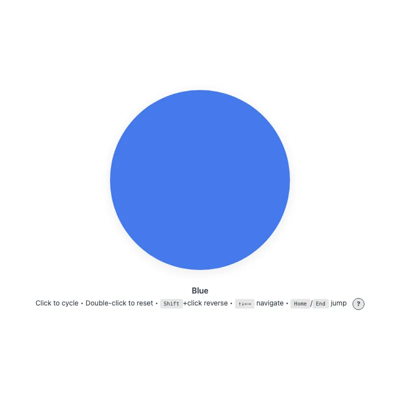
offline render, Chrome 154, light scheme, 2 s of virtual time
runs in a sandboxed frame with no origin; live pages may fetch CDN fonts the offline render did not
<!DOCTYPE html>
<html lang="en">
<head>
  <meta charset="UTF-8">
  <meta name="viewport" content="width=device-width, initial-scale=1.0">
  <meta name="color-scheme" content="light dark">
  <title>Animated Circle - Interactive Demo</title>
  <meta name="description" content="A responsive, accessible circle that changes color when clicked">
  <meta name="theme-color" content="#ffffff" media="(prefers-color-scheme: light)">
  <meta name="theme-color" content="#111111" media="(prefers-color-scheme: dark)">
  <link rel="icon" href="data:,">
  <style>
    *,
    *::before,
    *::after {
      box-sizing: border-box;
      margin: 0;
      padding: 0;
    }
    :root {
      color-scheme: light dark;
      --bg: #fff;
      --text: #374151;
      --fg: #2563eb;
      --shadow: rgba(0, 0, 0, 0.1);
      --kbd-bg: rgba(0, 0, 0, 0.1);
      --drop: drop-shadow(0 4px 12px var(--shadow));
    }
    [data-color="red"] { --fg: #dc2626; }
    [data-color="green"] { --fg: #16a34a; }
    [data-color="amber"] { --fg: #d97706; }
    [data-color="violet"] { --fg: #7c3aed; }
    [data-color="cyan"] { --fg: #0891b2; }
    @media (prefers-color-scheme: dark) {
      :root {
        --bg: #111;
        --text: #d1d5db;
        --fg: #93c5fd;
        --shadow: rgba(0, 0, 0, 0.6);
        --kbd-bg: rgba(255, 255, 255, 0.15);
      }
      [data-color="red"] { --fg: #fca5a5; }
      [data-color="green"] { --fg: #86efac; }
      [data-color="amber"] { --fg: #fcd34d; }
      [data-color="violet"] { --fg: #c4b5fd; }
      [data-color="cyan"] { --fg: #67e8f9; }
    }
    @media (prefers-contrast: more) {
      :root {
        --shadow: rgba(0, 0, 0, 0.9);
        --drop: drop-shadow(0 2px 8px var(--shadow));
      }
      .circle svg {
        opacity: 1;
      }
    }
    @media (forced-colors: active) {
      svg circle {
        stroke: CanvasText;
        stroke-width: 2;
      }
    }
    body {
      min-height: 100vh;
      min-height: 100dvh;
      display: grid;
      place-items: center;
      padding: 1rem;
      background: var(--bg);
      color: var(--text);
      font-family: system-ui, -apple-system, sans-serif;
    }
    main {
      width: 100%;
      display: flex;
      flex-direction: column;
      align-items: center;
      text-align: center;
    }
    .circle {
      display: block;
      width: min(360px, 100%, 60vh);
      aspect-ratio: 1;
      border: 0;
      border-radius: 50%;
      background: none;
      color: var(--fg);
      cursor: pointer;
      touch-action: manipulation;
      -webkit-tap-highlight-color: transparent;
      /* Shift+click and double-click would otherwise select the text below */
      -webkit-user-select: none;
      user-select: none;
      transition: color 0.4s ease;
      min-height: 48px;
      min-width: 48px;
    }
    .no-transition,
    .no-transition svg {
      transition: none !important;
    }
    .circle:focus-visible {
      outline: 3px solid currentColor;
      /* Must clear the scaled-up circle (up to 9px) or the ring merges with it */
      outline-offset: 12px;
    }
    svg {
      display: block;
      width: 100%;
      height: 100%;
      overflow: visible;
      opacity: 0.85;
      filter: var(--drop);
      transition: opacity 0.3s ease;
    }
    .circle:active svg,
    .circle:focus-visible svg {
      opacity: 1;
    }
    @keyframes pulse {
      0% {
        filter: var(--drop) drop-shadow(0 0 16px currentColor);
      }
      100% {
        filter: var(--drop) drop-shadow(0 0 0 transparent);
      }
    }
    @media (hover: hover) {
      .circle:hover svg {
        opacity: 1;
      }
    }
    @media (prefers-reduced-motion: no-preference) {
      svg {
        transition:
          transform 0.3s cubic-bezier(0.34, 1.56, 0.64, 1),
          opacity 0.3s ease;
      }
      .circle:focus-visible svg {
        transform: scale(1.05);
      }
      .circle:active svg {
        transform: scale(0.97);
      }
      .circle.color-changed svg {
        animation: pulse 0.5s ease-out;
      }
    }
    @media (hover: hover) and (prefers-reduced-motion: no-preference) {
      .circle:hover:not(:active) svg {
        transform: scale(1.05);
      }
    }
    .visually-hidden {
      position: absolute;
      width: 1px;
      height: 1px;
      overflow: hidden;
      clip-path: inset(50%);
      white-space: nowrap;
    }
    .status {
      margin-top: 2rem;
      font-weight: 600;
    }
    .hint {
      margin-top: 0.25rem;
      font-size: 0.875rem;
      line-height: 1.75;
    }
    .help-button {
      margin-left: 0.5rem;
      display: inline-block;
      width: 1.5rem;
      height: 1.5rem;
      border-radius: 50%;
      background: var(--kbd-bg);
      border: 1px solid var(--text);
      color: var(--text);
      cursor: pointer;
      font: inherit;
      font-size: 0.75rem;
      font-weight: bold;
      line-height: 1;
      text-align: center;
      vertical-align: middle;
      touch-action: manipulation;
      transition: background-color 0.2s ease, color 0.2s ease;
    }
    .help-button:focus-visible {
      outline: 2px solid currentColor;
      outline-offset: 2px;
    }
    @media (hover: hover) {
      /* Not currentColor: it would resolve to the hover color and hide the "?" */
      .help-button:hover {
        background: var(--text);
        color: var(--bg);
      }
    }
    .keys {
      display: none;
    }
    .keys.visible {
      display: inline;
    }
    @media (hover: none) and (pointer: coarse) {
      .hint .keys {
        display: none !important;
      }
      .help-button {
        display: none;
      }
    }
    kbd {
      display: inline-block;
      padding: 0.125rem 0.375rem;
      background: var(--kbd-bg);
      border: 1px solid transparent;
      border-radius: 0.25rem;
      font-family: monospace;
      font-size: 0.75em;
      line-height: 1.2;
    }
  </style>
</head>
<body>
  <main>
    <h1 class="visually-hidden">Animated Circle</h1>
    <button type="button" class="circle no-transition" aria-label="Change circle color" aria-describedby="status hint">
      <svg viewBox="0 0 100 100" aria-hidden="true" focusable="false" xmlns="http://www.w3.org/2000/svg">
        <circle cx="50" cy="50" r="50" fill="currentColor"/>
      </svg>
    </button>
    <p class="status" id="status" role="status">Blue</p>
    <p class="hint"><span id="hint"><span class="verb">Click</span> to cycle • <span class="double-verb">Double-click</span> to reset<span class="keys" id="keys"> • <kbd>Shift</kbd>+click reverse • <kbd>↑↓←→</kbd> navigate • <kbd>Home</kbd>/<kbd>End</kbd> jump</span></span> <button type="button" class="help-button" aria-label="Keyboard shortcuts" aria-expanded="false" aria-controls="keys"><span aria-hidden="true">?</span></button></p>
  </main>
  <script>
    const button = document.querySelector('.circle');
    const status = document.querySelector('.status');
    const helpButton = document.querySelector('.help-button');
    const keyHint = document.querySelector('.keys');
    const colors = ['blue', 'red', 'green', 'amber', 'violet', 'cyan'];
    const storageKey = 'circle-color';
    const reducedMotion = matchMedia('(prefers-reduced-motion: reduce)');

    // Safely retrieve saved color from localStorage, returning null if unavailable
    function loadColor() {
      try {
        return localStorage.getItem(storageKey);
      } catch {
        return null;
      }
    }

    // Safely save color to localStorage, silently failing if unavailable
    function saveColor(color) {
      try {
        localStorage.setItem(storageKey, color);
      } catch {}
    }

    const savedColor = loadColor();
    let index = colors.includes(savedColor) ? colors.indexOf(savedColor) : 0;

    // Apply current color to button and update status display
    function applyColor() {
      const color = colors[index];
      if (color === 'blue') {
        delete button.dataset.color;
      } else {
        button.dataset.color = color;
      }
      // The status live region announces the change; the button's label stays
      // fixed so screen readers don't read the color twice
      status.textContent = color[0].toUpperCase() + color.slice(1);
    }

    // Switch to the color at the given index, persist it and trigger pulse animation
    function setIndex(next, { haptic = false } = {}) {
      // Home/End at the boundary shouldn't pulse or rewrite storage
      if (next === index) return;
      index = next;
      applyColor();
      saveColor(colors[index]);

      // Haptic feedback for supported devices
      if (haptic && navigator.vibrate) navigator.vibrate(50);

      // With reduced motion no animation runs, so animationend would never clear the class
      if (reducedMotion.matches) return;
      button.classList.remove('color-changed');
      void button.offsetWidth;
      button.classList.add('color-changed');
    }

    // Cycle color by step amount
    function changeColor(step) {
      setIndex((index + step + colors.length) % colors.length, { haptic: true });
    }

    applyColor();
    // Double rAF ensures paint completes before enabling animations
    requestAnimationFrame(() => requestAnimationFrame(() => {
      button.classList.remove('no-transition');
    }));

    // Update instructions to show "Tap" on touch devices or "Click" on hover-capable devices
    const hoverQuery = matchMedia('(hover: none)');
    const verbSpan = document.querySelector('.hint .verb');
    const doubleVerbSpan = document.querySelector('.hint .double-verb');
    function updateVerb() {
      verbSpan.textContent = hoverQuery.matches ? 'Tap' : 'Click';
      doubleVerbSpan.textContent = hoverQuery.matches ? 'Double-tap' : 'Double-click';
    }
    updateVerb();
    hoverQuery.addEventListener('change', updateVerb);

    // Space and Enter activate through the native click, but keyboard-synthesized
    // clicks don't reliably carry shiftKey, so remember it from the key events
    let shiftHeld = false;
    const isActivationKey = (event) => event.key === 'Enter' || event.key === ' ';
    // Space clicks on keyup; Enter already clicked on keydown, so updating
    // shiftHeld on Enter's keyup would leak into the next mouse click
    button.addEventListener('keyup', (event) => {
      if (event.key === ' ') shiftHeld = event.shiftKey;
    });
    button.addEventListener('blur', () => {
      shiftHeld = false;
    });

    const keySteps = { ArrowRight: 1, ArrowDown: 1, ArrowLeft: -1, ArrowUp: -1 };
    button.addEventListener('keydown', (event) => {
      if (isActivationKey(event)) {
        // Holding Enter would otherwise fire a click on every repeat; no click
        // follows to reset shiftHeld, so setting it here would leak into the
        // next mouse click
        if (event.repeat) {
          if (event.key === 'Enter') event.preventDefault();
          return;
        }
        shiftHeld = event.shiftKey;
        return;
      }
      if (event.altKey || event.ctrlKey || event.metaKey) return;
      if (event.key in keySteps) {
        event.preventDefault();
        changeColor(keySteps[event.key]);
      } else if (event.key === 'Home') {
        event.preventDefault();
        setIndex(0, { haptic: true });
      } else if (event.key === 'End') {
        event.preventDefault();
        setIndex(colors.length - 1, { haptic: true });
      }
    });
    button.addEventListener('click', (event) => {
      // event.detail is 2+ for clicks that are part of a dblclick; skip them
      // so double-click resets cleanly instead of cycling twice then resetting
      if (event.detail > 1) return;
      changeColor(event.shiftKey || shiftHeld ? -1 : 1);
      shiftHeld = false;
    });
    button.addEventListener('animationend', () => {
      button.classList.remove('color-changed');
    });
    button.addEventListener('dblclick', (event) => {
      event.preventDefault();
      setIndex(0);
    });
    helpButton.addEventListener('click', () => {
      const expanded = keyHint.classList.toggle('visible');
      helpButton.setAttribute('aria-expanded', expanded);
    });
    // Show keyboard shortcuts by default on desktop
    if (!hoverQuery.matches) {
      keyHint.classList.add('visible');
      helpButton.setAttribute('aria-expanded', 'true');
    }
    // Sync color across tabs when storage changes
    addEventListener('storage', (event) => {
      // key is null when another tab calls localStorage.clear()
      if (event.key !== storageKey && event.key !== null) return;
      const newIndex = colors.indexOf(event.newValue);
      index = newIndex === -1 ? 0 : newIndex;
      applyColor();
    });
  </script>
</body>
</html>
what changed from step 034
+3 / -0 lines
}); button.addEventListener('click', (event) => {+ // event.detail is 2+ for clicks that are part of a dblclick; skip them+ // so double-click resets cleanly instead of cycling twice then resetting+ if (event.detail > 1) return; changeColor(event.shiftKey || shiftHeld ? -1 : 1); shiftHeld = false;
What the model said
I couldn't open the file in a browser to visually verify (opening apps requires approval I can't get in this session), but the fix is minimal and low-risk: standard `event.detail` handling for click vs. dblclick.

**Change made:** In the `click` handler, clicks with `event.detail > 1` (i.e., part of a double-click) are now ignored, so double-clicking resets straight to blue instead of cycling the color twice (with duplicate vibration/pulse/status announcements) and then snapping back.

If you'd like, I can look at other aspects (e.g., the intermediate `no-transition` timing, or accessibility of the help toggle) — just let me know what you'd like improved next.