Runs/circle · chain · Sonnet 5/006
circle · chain · Sonnet 5 · step 006 of 64
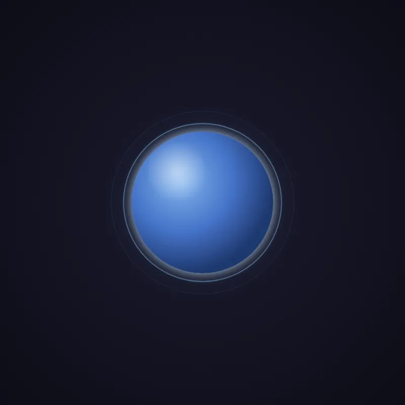
offline render, Chrome 154, light scheme, 2 s of virtual time
runs in a sandboxed frame with no origin; live pages may fetch CDN fonts the offline render did not
<!DOCTYPE html>
<html lang="en">
<head>
  <meta charset="UTF-8">
  <meta name="viewport" content="width=device-width, initial-scale=1.0">
  <title>Pulsing Circle</title>
  <style>
    :root {
      --circle-hue: #8ec5ff;
      --circle-core: #4a7dd9;
      --circle-shadow: #1f3a75;
      --cycle: 2.5s;
    }
    * {
      margin: 0;
      padding: 0;
      box-sizing: border-box;
    }
    body {
      width: 100vw;
      height: 100vh;
      display: flex;
      justify-content: center;
      align-items: center;
      background: radial-gradient(circle at center, #1a1a2e 0%, #0d0d17 100%);
      overflow: hidden;
    }
    svg {
      width: min(400px, 80vmin);
      height: min(400px, 80vmin);
      overflow: visible;
    }
    .ambient {
      fill: var(--circle-hue);
      opacity: 0.12;
      filter: blur(30px);
      animation: breathe var(--cycle) cubic-bezier(0.4, 0, 0.2, 1) infinite;
      transform-origin: 200px 200px;
    }
    .core {
      animation: pulse var(--cycle) cubic-bezier(0.4, 0, 0.2, 1) infinite;
      transform-origin: 200px 200px;
      filter: url(#glow);
      will-change: transform, opacity;
    }
    .highlight {
      fill: url(#highlightGradient);
      transform-origin: 200px 200px;
      animation: pulse var(--cycle) cubic-bezier(0.4, 0, 0.2, 1) infinite;
      pointer-events: none;
    }
    .ring {
      fill: none;
      stroke: var(--circle-hue);
      stroke-width: 2.5;
      transform-origin: 200px 200px;
      animation: ripple var(--cycle) cubic-bezier(0.2, 0.6, 0.4, 1) infinite;
      will-change: transform, opacity, stroke-width;
    }
    .ring--delay-1 {
      animation-delay: calc(var(--cycle) / 3);
    }
    .ring--delay-2 {
      animation-delay: calc(var(--cycle) / 3 * 2);
    }
    @keyframes pulse {
      0%, 100% {
        transform: scale(1);
        opacity: 0.9;
      }
      50% {
        transform: scale(1.05);
        opacity: 1;
      }
    }
    @keyframes breathe {
      0%, 100% {
        transform: scale(0.95);
        opacity: 0.1;
      }
      50% {
        transform: scale(1.1);
        opacity: 0.18;
      }
    }
    @keyframes ripple {
      0% {
        transform: scale(1);
        opacity: 0.6;
        stroke-width: 2.5;
      }
      100% {
        transform: scale(1.35);
        opacity: 0;
        stroke-width: 0.5;
      }
    }
    @media (prefers-reduced-motion: reduce) {
      .core, .ring, .ambient, .highlight {
        animation: none;
      }
      .ring {
        opacity: 0.35;
      }
      .ambient {
        opacity: 0.12;
      }
    }
  </style>
</head>
<body>
  <svg id="ae683f770" viewBox="0 0 400 400" role="img" aria-label="Pulsing blue circle animation">
    <defs>
      <radialGradient id="circleGradient" cx="35%" cy="35%" r="65%">
        <stop offset="0%" stop-color="#8ec5ff"/>
        <stop offset="55%" stop-color="#4a7dd9"/>
        <stop offset="100%" stop-color="#1f3a75"/>
      </radialGradient>
      <radialGradient id="highlightGradient" cx="32%" cy="28%" r="22%">
        <stop offset="0%" stop-color="#ffffff" stop-opacity="0.55"/>
        <stop offset="100%" stop-color="#ffffff" stop-opacity="0"/>
      </radialGradient>
      <filter id="glow" x="-80%" y="-80%" width="260%" height="260%">
        <feGaussianBlur in="SourceGraphic" stdDeviation="10" result="blur"/>
        <feColorMatrix in="blur" type="matrix"
          values="0 0 0 0 0.55  0 0 0 0 0.77  0 0 0 0 1  0 0 0 0.9 0" result="tintedBlur"/>
        <feMerge>
          <feMergeNode in="tintedBlur"/>
          <feMergeNode in="SourceGraphic"/>
        </feMerge>
      </filter>
    </defs>
    <circle class="ambient" cx="200" cy="200" r="160"/>
    <circle class="ring" cx="200" cy="200" r="140"/>
    <circle class="ring ring--delay-1" cx="200" cy="200" r="140"/>
    <circle class="ring ring--delay-2" cx="200" cy="200" r="140"/>
    <circle class="core" cx="200" cy="200" r="140" fill="url(#circleGradient)"/>
    <circle class="highlight" cx="200" cy="200" r="140"/>
  </svg>
</body>
</html>
what changed from step 005
+48 / -8 lines
<title>Pulsing Circle</title> <style>+ :root {+ --circle-hue: #8ec5ff;+ --circle-core: #4a7dd9;+ --circle-shadow: #1f3a75;+ --cycle: 2.5s;+ } * { margin: 0;⋯ line 31 overflow: visible; }+ .ambient {+ fill: var(--circle-hue);+ opacity: 0.12;+ filter: blur(30px);+ animation: breathe var(--cycle) cubic-bezier(0.4, 0, 0.2, 1) infinite;+ transform-origin: 200px 200px;+ } .core {- animation: pulse 2.5s cubic-bezier(0.4, 0, 0.2, 1) infinite;+ animation: pulse var(--cycle) cubic-bezier(0.4, 0, 0.2, 1) infinite; transform-origin: 200px 200px; filter: url(#glow); will-change: transform, opacity; }+ .highlight {+ fill: url(#highlightGradient);+ transform-origin: 200px 200px;+ animation: pulse var(--cycle) cubic-bezier(0.4, 0, 0.2, 1) infinite;+ pointer-events: none;+ } .ring { fill: none;- stroke: #8ec5ff;- stroke-width: 2;+ stroke: var(--circle-hue);+ stroke-width: 2.5; transform-origin: 200px 200px;- animation: ripple 2.5s cubic-bezier(0.2, 0.6, 0.4, 1) infinite;- will-change: transform, opacity;+ animation: ripple var(--cycle) cubic-bezier(0.2, 0.6, 0.4, 1) infinite;+ will-change: transform, opacity, stroke-width; } .ring--delay-1 {- animation-delay: 0.83s;+ animation-delay: calc(var(--cycle) / 3); } .ring--delay-2 {- animation-delay: 1.66s;+ animation-delay: calc(var(--cycle) / 3 * 2); } @keyframes pulse {⋯ line 74 } }+ @keyframes breathe {+ 0%, 100% {+ transform: scale(0.95);+ opacity: 0.1;+ }+ 50% {+ transform: scale(1.1);+ opacity: 0.18;+ }+ } @keyframes ripple { 0% { transform: scale(1); opacity: 0.6;+ stroke-width: 2.5; } 100% { transform: scale(1.35); opacity: 0;+ stroke-width: 0.5; } } @media (prefers-reduced-motion: reduce) {- .core, .ring {+ .core, .ring, .ambient, .highlight { animation: none; }⋯ line 103 opacity: 0.35; }+ .ambient {+ opacity: 0.12;+ } } </style>⋯ line 117 <stop offset="100%" stop-color="#1f3a75"/> </radialGradient>+ <radialGradient id="highlightGradient" cx="32%" cy="28%" r="22%">+ <stop offset="0%" stop-color="#ffffff" stop-opacity="0.55"/>+ <stop offset="100%" stop-color="#ffffff" stop-opacity="0"/>+ </radialGradient> <filter id="glow" x="-80%" y="-80%" width="260%" height="260%"> <feGaussianBlur in="SourceGraphic" stdDeviation="10" result="blur"/>⋯ line 131 </filter> </defs>+ <circle class="ambient" cx="200" cy="200" r="160"/> <circle class="ring" cx="200" cy="200" r="140"/> <circle class="ring ring--delay-1" cx="200" cy="200" r="140"/> <circle class="ring ring--delay-2" cx="200" cy="200" r="140"/> <circle class="core" cx="200" cy="200" r="140" fill="url(#circleGradient)"/>+ <circle class="highlight" cx="200" cy="200" r="140"/> </svg> </body>
What the model said
I couldn't auto-open the file in a browser (blocked, no approval surface available), but the edits are complete — feel free to open `0.html` yourself to preview.

Summary of improvements:
- Added CSS custom properties (`--circle-hue`, `--cycle`, etc.) so colors/timing are easy to tweak in one place, and evenly spaced ring delays via `calc()`.
- Added a soft blurred "ambient" circle behind everything for depth.
- Animated the ripple rings' `stroke-width` (thick → thin) as they expand, for a more natural dissipating look.
- Added a specular highlight gradient/ellipse on the core for a subtle 3D sheen.
- Extended `prefers-reduced-motion` handling to cover the new ambient/highlight layers.