Runs/circle · chain · Sonnet 5/005
circle · chain · Sonnet 5 · step 005 of 64
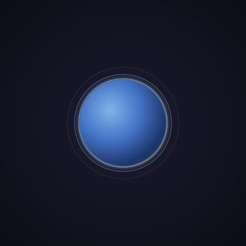
offline render, Chrome 154, light scheme, 2 s of virtual time
runs in a sandboxed frame with no origin; live pages may fetch CDN fonts the offline render did not
<!DOCTYPE html>
<html lang="en">
<head>
  <meta charset="UTF-8">
  <meta name="viewport" content="width=device-width, initial-scale=1.0">
  <title>Pulsing Circle</title>
  <style>
    * {
      margin: 0;
      padding: 0;
      box-sizing: border-box;
    }
    body {
      width: 100vw;
      height: 100vh;
      display: flex;
      justify-content: center;
      align-items: center;
      background: radial-gradient(circle at center, #1a1a2e 0%, #0d0d17 100%);
      overflow: hidden;
    }
    svg {
      width: min(400px, 80vmin);
      height: min(400px, 80vmin);
      overflow: visible;
    }
    .core {
      animation: pulse 2.5s cubic-bezier(0.4, 0, 0.2, 1) infinite;
      transform-origin: 200px 200px;
      filter: url(#glow);
      will-change: transform, opacity;
    }
    .ring {
      fill: none;
      stroke: #8ec5ff;
      stroke-width: 2;
      transform-origin: 200px 200px;
      animation: ripple 2.5s cubic-bezier(0.2, 0.6, 0.4, 1) infinite;
      will-change: transform, opacity;
    }
    .ring--delay-1 {
      animation-delay: 0.83s;
    }
    .ring--delay-2 {
      animation-delay: 1.66s;
    }
    @keyframes pulse {
      0%, 100% {
        transform: scale(1);
        opacity: 0.9;
      }
      50% {
        transform: scale(1.05);
        opacity: 1;
      }
    }
    @keyframes ripple {
      0% {
        transform: scale(1);
        opacity: 0.6;
      }
      100% {
        transform: scale(1.35);
        opacity: 0;
      }
    }
    @media (prefers-reduced-motion: reduce) {
      .core, .ring {
        animation: none;
      }
      .ring {
        opacity: 0.35;
      }
    }
  </style>
</head>
<body>
  <svg id="ae683f770" viewBox="0 0 400 400" role="img" aria-label="Pulsing blue circle animation">
    <defs>
      <radialGradient id="circleGradient" cx="35%" cy="35%" r="65%">
        <stop offset="0%" stop-color="#8ec5ff"/>
        <stop offset="55%" stop-color="#4a7dd9"/>
        <stop offset="100%" stop-color="#1f3a75"/>
      </radialGradient>
      <filter id="glow" x="-80%" y="-80%" width="260%" height="260%">
        <feGaussianBlur in="SourceGraphic" stdDeviation="10" result="blur"/>
        <feColorMatrix in="blur" type="matrix"
          values="0 0 0 0 0.55  0 0 0 0 0.77  0 0 0 0 1  0 0 0 0.9 0" result="tintedBlur"/>
        <feMerge>
          <feMergeNode in="tintedBlur"/>
          <feMergeNode in="SourceGraphic"/>
        </feMerge>
      </filter>
    </defs>
    <circle class="ring" cx="200" cy="200" r="140"/>
    <circle class="ring ring--delay-1" cx="200" cy="200" r="140"/>
    <circle class="ring ring--delay-2" cx="200" cy="200" r="140"/>
    <circle class="core" cx="200" cy="200" r="140" fill="url(#circleGradient)"/>
  </svg>
</body>
</html>
what changed from step 004
+10 / -8 lines
stroke-width: 2; transform-origin: 200px 200px;- animation: ripple 2.5s ease-out infinite;+ animation: ripple 2.5s cubic-bezier(0.2, 0.6, 0.4, 1) infinite; will-change: transform, opacity; }⋯ line 83 <stop offset="100%" stop-color="#1f3a75"/> </radialGradient>- <filter id="glow" x="-50%" y="-50%" width="200%" height="200%">- <feGaussianBlur in="SourceGraphic" stdDeviation="8" result="blur"/>+ <filter id="glow" x="-80%" y="-80%" width="260%" height="260%">+ <feGaussianBlur in="SourceGraphic" stdDeviation="10" result="blur"/>+ <feColorMatrix in="blur" type="matrix"+ values="0 0 0 0 0.55 0 0 0 0 0.77 0 0 0 0 1 0 0 0 0.9 0" result="tintedBlur"/> <feMerge>- <feMergeNode in="blur"/>+ <feMergeNode in="tintedBlur"/> <feMergeNode in="SourceGraphic"/> </feMerge> </filter> </defs>- <circle class="ring" cx="200" cy="200" r="180"/>- <circle class="ring ring--delay-1" cx="200" cy="200" r="180"/>- <circle class="ring ring--delay-2" cx="200" cy="200" r="180"/>- <circle class="core" cx="200" cy="200" r="180" fill="url(#circleGradient)"/>+ <circle class="ring" cx="200" cy="200" r="140"/>+ <circle class="ring ring--delay-1" cx="200" cy="200" r="140"/>+ <circle class="ring ring--delay-2" cx="200" cy="200" r="140"/>+ <circle class="core" cx="200" cy="200" r="140" fill="url(#circleGradient)"/> </svg> </body>
What the model said
I couldn't open the file in a browser to preview it (that action needed approval and got auto-denied), but here's what I improved:

- Ring radius reduced 180→140 so ripples no longer risk clipping against the viewport edge at max scale (1.35×).
- Ripple easing changed to a smoother custom cubic-bezier instead of plain `ease-out`.
- Glow filter now tints the blur blue (via `feColorMatrix`) instead of a plain grayscale blur, and enlarged its bounding box (`-80%/260%`) so the stronger glow isn't cut off.

Open `0.html` in a browser to check the result — let me know if you want a different color scheme, speed, or additional effects.