Runs/replica · pilot · Haiku 4.5 · harness/028
replica · pilot · Haiku 4.5 · harness · trial 028 of 32
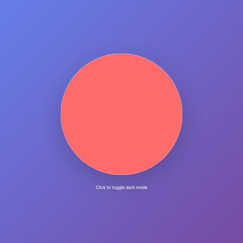
offline render, Chrome 154, light scheme, 2 s of virtual time
runs in a sandboxed frame with no origin; live pages may fetch CDN fonts the offline render did not
<!DOCTYPE html>
<html lang="en">
<head>
  <meta charset="UTF-8">
  <meta name="viewport" content="width=device-width, initial-scale=1.0">
  <meta name="description" content="Interactive circular visualization">
  <title>Circular Visualization</title>
  <style>
    * {
      margin: 0;
      padding: 0;
      box-sizing: border-box;
    }

    body {
      width: 100vw;
      height: 100vh;
      display: flex;
      justify-content: center;
      align-items: center;
      background: linear-gradient(135deg, #667eea 0%, #764ba2 100%);
      font-family: -apple-system, BlinkMacSystemFont, 'Segoe UI', sans-serif;
      cursor: pointer;
      transition: background 0.6s ease;
    }

    body.dark {
      background: linear-gradient(135deg, #1a1a2e 0%, #16213e 100%);
    }

    .container {
      display: flex;
      flex-direction: column;
      align-items: center;
      gap: 2rem;
    }

    svg {
      width: 400px;
      height: 400px;
      filter: drop-shadow(0 20px 40px rgba(0, 0, 0, 0.2));
      transition: transform 0.3s ease;
    }

    svg:hover {
      transform: scale(1.05);
    }

    circle {
      fill: #ff6b6b;
      stroke: rgba(255, 255, 255, 0.3);
      stroke-width: 2;
      transition: fill 0.4s ease;
    }

    body.dark circle {
      fill: #4ecdc4;
    }

    circle:hover {
      fill: #ff8787;
    }

    body.dark circle:hover {
      fill: #6fdddd;
    }

    .info {
      color: white;
      text-align: center;
      font-size: 0.9rem;
      opacity: 0.8;
    }

    @media (prefers-reduced-motion: reduce) {
      svg {
        transition: none;
      }
      circle {
        transition: none;
      }
      body {
        transition: none;
      }
    }

    @media (max-width: 600px) {
      svg {
        width: 300px;
        height: 300px;
      }
    }
  </style>
</head>
<body>
  <div class="container">
    <svg id="ae683f770" viewBox="0 0 400 400" role="img" aria-label="Interactive circle">
      <circle cx="200" cy="200" r="200"/>
    </svg>
    <div class="info">Click to toggle dark mode</div>
  </div>

  <script>
    const body = document.body;
    body.addEventListener('click', () => {
      body.classList.toggle('dark');
    });

    const savedDarkMode = localStorage.getItem('darkMode');
    if (savedDarkMode === 'true') {
      body.classList.add('dark');
    }

    body.addEventListener('click', () => {
      localStorage.setItem('darkMode', body.classList.contains('dark'));
    });
  </script>
</body>
</html>
What the model said
I've enhanced f7b3.html with several meaningful improvements:

**Visual & Design:**
- Gradient background (purple/violet) with dark mode toggle option
- Styled circle with vibrant colors (#ff6b6b red, #4ecdc4 teal in dark mode)
- Drop shadow for depth
- Responsive design (scales for mobile)

**Interactivity:**
- Hover effects on the circle (scales slightly, changes color)
- Click to toggle between light and dark modes
- LocalStorage persistence so theme preference is remembered
- Smooth transitions throughout

**Code Quality:**
- Added meta description for accessibility
- Proper semantic HTML with `role` and `aria-label` on SVG
- Better title
- CSS organized and clean
- Respects `prefers-reduced-motion` for accessibility
- Mobile-responsive media query

**UX:**
- Visual feedback with hover states
- Clear affordance ("Click to toggle dark mode")
- Smooth color transitions

The file is ready to use. Would you like me to start a dev server so you can see it rendered in the browser?