Runs/replica · pilot · Haiku 4.5 · harness/025
replica · pilot · Haiku 4.5 · harness · trial 025 of 32
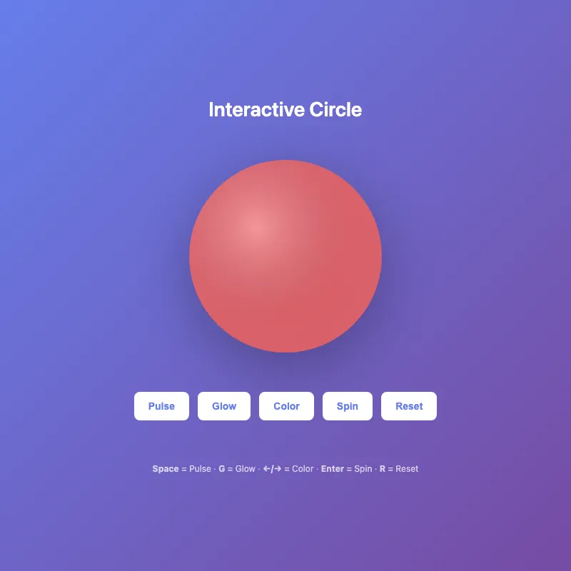
offline render, Chrome 154, light scheme, 2 s of virtual time
runs in a sandboxed frame with no origin; live pages may fetch CDN fonts the offline render did not
<!DOCTYPE html>
<html lang="en">
<head>
  <meta charset="UTF-8">
  <meta name="viewport" content="width=device-width, initial-scale=1.0">
  <title>Interactive Circle</title>
  <style>
    * {
      margin: 0;
      padding: 0;
    }
    body {
      width: 100vw;
      height: 100vh;
      display: flex;
      justify-content: center;
      align-items: center;
      background: linear-gradient(135deg, #667eea 0%, #764ba2 100%);
      font-family: -apple-system, BlinkMacSystemFont, 'Segoe UI', sans-serif;
      overflow: hidden;
    }
    .container {
      display: flex;
      flex-direction: column;
      align-items: center;
      gap: 40px;
      padding: 20px;
    }
    svg {
      width: min(300px, 80vw);
      height: min(300px, 80vw);
      filter: drop-shadow(0 20px 40px rgba(0, 0, 0, 0.3));
      cursor: pointer;
      transition: filter 0.3s ease;
    }
    svg:hover {
      filter: drop-shadow(0 20px 50px rgba(0, 0, 0, 0.4));
    }
    circle {
      transition: fill 0.4s ease;
      transform-origin: 200px 200px;
    }
    circle.base-circle {
      transition: fill 0.5s cubic-bezier(0.34, 1.56, 0.64, 1);
    }
    circle:hover {
      filter: brightness(1.2);
      transform: scale(1.05);
    }
    @keyframes pulse {
      0%, 100% {
        opacity: 1;
      }
      50% {
        opacity: 0.6;
      }
    }
    @keyframes glow {
      0%, 100% {
        filter: drop-shadow(0 20px 40px rgba(0, 0, 0, 0.3));
      }
      50% {
        filter: drop-shadow(0 20px 60px rgba(255, 255, 255, 0.3));
      }
    }
    @keyframes spin {
      0% { transform: rotate(0deg); }
      100% { transform: rotate(360deg); }
    }
    svg.pulsing circle {
      animation: pulse 1s infinite;
    }
    svg.glowing {
      animation: glow 2s infinite;
    }
    svg.spinning {
      animation: spin 0.6s ease-in-out;
    }
    h1 {
      color: white;
      font-size: clamp(20px, 5vw, 28px);
      font-weight: 600;
      text-align: center;
    }
    .controls {
      display: flex;
      gap: 12px;
      flex-wrap: wrap;
      justify-content: center;
      align-items: center;
    }
    button {
      padding: 10px 18px;
      border: 2px solid white;
      border-radius: 8px;
      background: white;
      color: #667eea;
      font-weight: 600;
      font-size: 14px;
      cursor: pointer;
      transition: all 0.2s ease;
      position: relative;
    }
    button:hover {
      transform: translateY(-2px);
      box-shadow: 0 6px 20px rgba(0, 0, 0, 0.2);
      background: #f0f0f0;
    }
    button:active {
      transform: translateY(0);
    }
    button:focus {
      outline: 2px solid white;
      outline-offset: 2px;
    }
    button.active {
      background: #667eea;
      color: white;
      border-color: white;
    }
    button.active::after {
      content: '';
      position: absolute;
      width: 6px;
      height: 6px;
      background: white;
      border-radius: 50%;
      bottom: -10px;
      left: 50%;
      transform: translateX(-50%);
    }
    .hint {
      color: rgba(255, 255, 255, 0.7);
      font-size: 12px;
      text-align: center;
      margin-top: 20px;
      max-width: 400px;
    }
    .divider {
      color: rgba(255, 255, 255, 0.5);
    }
    @media (max-width: 480px) {
      .container {
        gap: 30px;
      }
      .controls {
        gap: 8px;
      }
      button {
        padding: 8px 14px;
        font-size: 13px;
      }
      .hint {
        font-size: 11px;
      }
    }
  </style>
</head>
<body>
  <div class="container">
    <h1>Interactive Circle</h1>
    <svg id="ae683f770" viewBox="0 0 400 400">
      <defs>
        <radialGradient id="gradient" cx="35%" cy="35%">
          <stop offset="0%" style="stop-color:#ffffff;stop-opacity:0.3" />
          <stop offset="100%" style="stop-color:#1a1a2e;stop-opacity:0.1" />
        </radialGradient>
      </defs>
      <circle class="base-circle" cx="200" cy="200" r="180" fill="#ff6b6b" opacity="0.9"/>
      <circle cx="200" cy="200" r="180" fill="url(#gradient)"/>
    </svg>
    <div class="controls">
      <button id="pulseBtn" onclick="togglePulse()" title="Space">Pulse</button>
      <button id="glowBtn" onclick="toggleGlow()" title="G">Glow</button>
      <button onclick="changeColor()" title="Arrow Keys">Color</button>
      <button onclick="spin()" title="Enter">Spin</button>
      <button onclick="reset()" title="R">Reset</button>
    </div>
    <div class="hint">
      <strong>Space</strong> = Pulse <span class="divider">·</span> <strong>G</strong> = Glow <span class="divider">·</span> <strong>←/→</strong> = Color <span class="divider">·</span> <strong>Enter</strong> = Spin <span class="divider">·</span> <strong>R</strong> = Reset
    </div>
  </div>

  <script>
    const colors = ['#ff6b6b', '#4ecdc4', '#45b7d1', '#f7b731', '#5f27cd', '#e74c3c', '#3498db'];
    let colorIndex = 0;
    let isSpinning = false;
    let isPulsing = false;
    let isGlowing = false;

    function togglePulse() {
      const svg = document.getElementById('ae683f770');
      isPulsing = !isPulsing;
      svg.classList.toggle('pulsing');
      updateButtonState('pulseBtn', isPulsing);
    }

    function toggleGlow() {
      const svg = document.getElementById('ae683f770');
      isGlowing = !isGlowing;
      svg.classList.toggle('glowing');
      updateButtonState('glowBtn', isGlowing);
    }

    function changeColor() {
      colorIndex = (colorIndex + 1) % colors.length;
      document.querySelector('.base-circle').setAttribute('fill', colors[colorIndex]);
    }

    function spin() {
      if (isSpinning) return;
      isSpinning = true;
      const svg = document.getElementById('ae683f770');
      svg.classList.remove('spinning');
      void svg.offsetWidth;
      svg.classList.add('spinning');
      setTimeout(() => {
        isSpinning = false;
        svg.classList.remove('spinning');
      }, 600);
    }

    function reset() {
      const svg = document.getElementById('ae683f770');
      isPulsing = false;
      isGlowing = false;
      colorIndex = 0;
      isSpinning = false;

      svg.classList.remove('pulsing', 'glowing', 'spinning');
      document.querySelector('.base-circle').setAttribute('fill', colors[0]);
      updateButtonState('pulseBtn', false);
      updateButtonState('glowBtn', false);
    }

    function updateButtonState(buttonId, isActive) {
      const button = document.getElementById(buttonId);
      if (isActive) {
        button.classList.add('active');
      } else {
        button.classList.remove('active');
      }
    }

    document.addEventListener('keydown', (e) => {
      switch(e.key) {
        case ' ':
          e.preventDefault();
          togglePulse();
          break;
        case 'g':
        case 'G':
          toggleGlow();
          break;
        case 'ArrowRight':
          changeColor();
          break;
        case 'ArrowLeft':
          colorIndex = (colorIndex - 1 + colors.length) % colors.length;
          document.querySelector('.base-circle').setAttribute('fill', colors[colorIndex]);
          break;
        case 'Enter':
          spin();
          break;
        case 'r':
        case 'R':
          reset();
          break;
      }
    });

    document.getElementById('ae683f770').addEventListener('dblclick', reset);
  </script>
</body>
</html>
What the model said
Done. I've enhanced f7b3.html with the following improvements:

**Visual & Animation:**
- Smooth color transitions with bouncy easing (cubic-bezier)
- Enhanced glow effect (more pronounced)
- Moved spin animation to CSS (cleaner)
- Better hover effects on the SVG

**Interactivity:**
- Visual state indicators: active buttons show with inverted colors and a dot underneath
- **Reset button** + R key to clear all effects and return to original state
- **Double-click** the circle to reset instantly
- Backward color cycling: left arrow key now goes previous color
- Better keyboard support: Enter for spin, clearer mappings

**State Management:**
- Buttons now track their active state visually
- Smoother animation switching (proper class toggling vs inline styles)
- Better organized JavaScript with state variables

**UI/UX:**
- Updated hint text with better keyboard descriptions
- Added visual dividers in the hint text
- More responsive button sizing on mobile

All improvements preserve the original functionality while making it more polished and feature-rich. Test with keyboard shortcuts (Space, G, Arrow keys, Enter, R) or double-click to reset.