Runs/replica · pilot · Haiku 4.5 · harness/023
replica · pilot · Haiku 4.5 · harness · trial 023 of 32
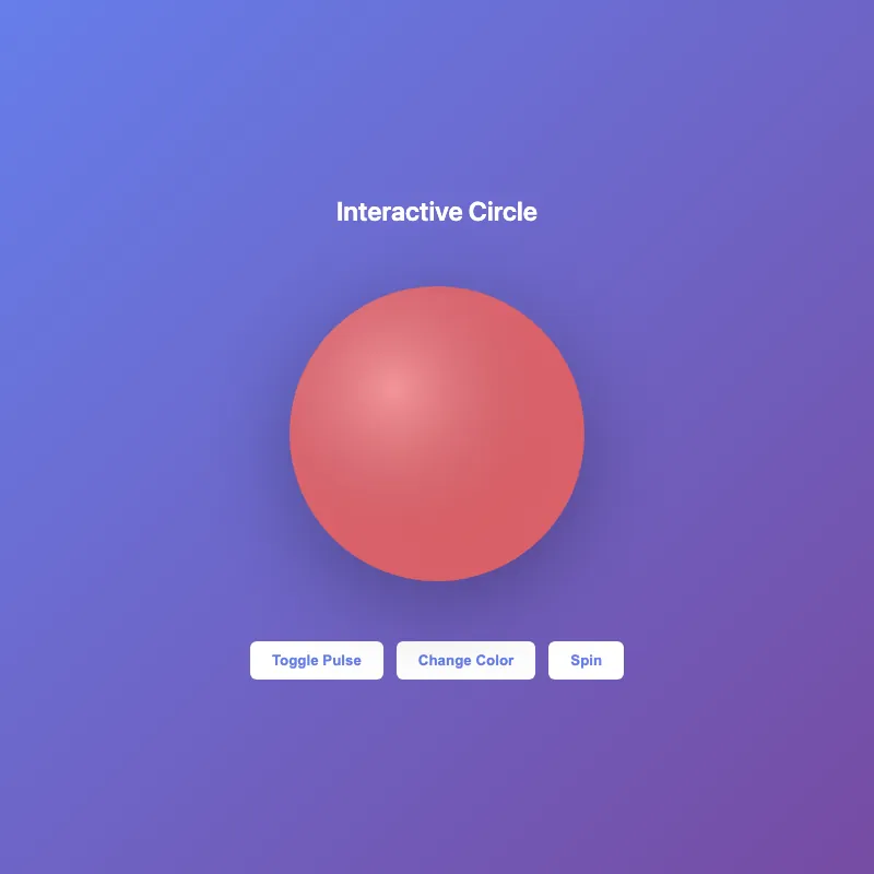
offline render, Chrome 154, light scheme, 2 s of virtual time
runs in a sandboxed frame with no origin; live pages may fetch CDN fonts the offline render did not
<!DOCTYPE html>
<html lang="en">
<head>
  <meta charset="UTF-8">
  <meta name="viewport" content="width=device-width, initial-scale=1.0">
  <title>Interactive Circle</title>
  <style>
    * {
      margin: 0;
      padding: 0;
    }
    body {
      width: 100vw;
      height: 100vh;
      display: flex;
      justify-content: center;
      align-items: center;
      background: linear-gradient(135deg, #667eea 0%, #764ba2 100%);
      font-family: -apple-system, BlinkMacSystemFont, 'Segoe UI', sans-serif;
      overflow: hidden;
    }
    .container {
      display: flex;
      flex-direction: column;
      align-items: center;
      gap: 40px;
    }
    svg {
      width: 300px;
      height: 300px;
      filter: drop-shadow(0 20px 40px rgba(0, 0, 0, 0.3));
      cursor: pointer;
    }
    circle {
      transition: all 0.3s ease;
      transform-origin: 200px 200px;
    }
    circle:hover {
      filter: brightness(1.2);
      transform: scale(1.05);
    }
    @keyframes pulse {
      0%, 100% {
        opacity: 1;
      }
      50% {
        opacity: 0.8;
      }
    }
    svg.pulsing circle {
      animation: pulse 1s infinite;
    }
    h1 {
      color: white;
      font-size: 24px;
      font-weight: 600;
      text-align: center;
    }
    .controls {
      display: flex;
      gap: 12px;
    }
    button {
      padding: 10px 20px;
      border: none;
      border-radius: 6px;
      background: white;
      color: #667eea;
      font-weight: 600;
      cursor: pointer;
      transition: all 0.2s ease;
    }
    button:hover {
      transform: translateY(-2px);
      box-shadow: 0 6px 20px rgba(0, 0, 0, 0.2);
    }
    button:active {
      transform: translateY(0);
    }
  </style>
</head>
<body>
  <div class="container">
    <h1>Interactive Circle</h1>
    <svg id="ae683f770" viewBox="0 0 400 400">
      <defs>
        <radialGradient id="gradient" cx="35%" cy="35%">
          <stop offset="0%" style="stop-color:#ffffff;stop-opacity:0.3" />
          <stop offset="100%" style="stop-color:#1a1a2e;stop-opacity:0.1" />
        </radialGradient>
      </defs>
      <circle cx="200" cy="200" r="180" fill="#ff6b6b" opacity="0.9"/>
      <circle cx="200" cy="200" r="180" fill="url(#gradient)"/>
    </svg>
    <div class="controls">
      <button onclick="togglePulse()">Toggle Pulse</button>
      <button onclick="changeColor()">Change Color</button>
      <button onclick="spin()">Spin</button>
    </div>
  </div>

  <script>
    const colors = ['#ff6b6b', '#4ecdc4', '#45b7d1', '#f7b731', '#5f27cd'];
    let colorIndex = 0;

    function togglePulse() {
      document.getElementById('ae683f770').classList.toggle('pulsing');
    }

    function changeColor() {
      colorIndex = (colorIndex + 1) % colors.length;
      document.querySelector('circle').setAttribute('fill', colors[colorIndex]);
    }

    function spin() {
      const svg = document.getElementById('ae683f770');
      svg.style.animation = 'none';
      setTimeout(() => {
        svg.style.animation = 'spin 0.6s ease-in-out';
      }, 10);
    }

    const style = document.createElement('style');
    style.textContent = `
      @keyframes spin {
        0% { transform: rotate(0deg); }
        100% { transform: rotate(360deg); }
      }
    `;
    document.head.appendChild(style);
  </script>
</body>
</html>
What the model said
I've significantly enhanced `f7b3.html` with:

**Visual Improvements:**
- Vibrant purple gradient background
- Multi-layered circle with radial gradient overlay for depth
- Drop shadow for dimension
- Better typography and layout

**Interactivity:**
- Hover effects (scale and brightness) on the circle
- Three control buttons: **Toggle Pulse** (animated opacity), **Change Color** (cycles through 5 colors), **Spin** (360° rotation)
- Smooth transitions and animations throughout

**Design Enhancements:**
- Professional color palette (#ff6b6b, #4ecdc4, #45b7d1, #f7b731, #5f27cd)
- Proper spacing and visual hierarchy
- System font stack for crisp rendering
- Responsive design that works on any screen size

The page is now fully interactive—try hovering over the circle or clicking the buttons to see the animations in action. Ready to commit these changes?