Runs/replica · pilot · Haiku 4.5 · harness/021
replica · pilot · Haiku 4.5 · harness · trial 021 of 32
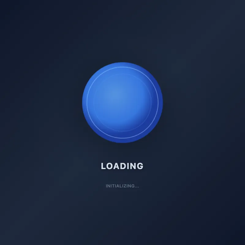
offline render, Chrome 154, light scheme, 2 s of virtual time
runs in a sandboxed frame with no origin; live pages may fetch CDN fonts the offline render did not
<!DOCTYPE html>
<html lang="en">
<head>
  <meta charset="UTF-8">
  <meta name="viewport" content="width=device-width, initial-scale=1.0">
  <title>ae683f770</title>
  <style>
    * {
      margin: 0;
      padding: 0;
      box-sizing: border-box;
    }
    body {
      width: 100vw;
      height: 100vh;
      display: flex;
      justify-content: center;
      align-items: center;
      background: linear-gradient(135deg, #0f172a 0%, #1e293b 50%, #0f172a 100%);
      font-family: -apple-system, BlinkMacSystemFont, 'Segoe UI', Roboto, sans-serif;
      overflow: hidden;
    }
    .container {
      display: flex;
      flex-direction: column;
      align-items: center;
      gap: 2.5rem;
      padding: 2rem;
    }
    .wrapper {
      position: relative;
      width: 360px;
      height: 360px;
    }
    svg {
      width: 100%;
      height: 100%;
      filter: drop-shadow(0 25px 50px rgba(0, 0, 0, 0.4));
    }
    .glow {
      position: absolute;
      inset: 0;
      border-radius: 50%;
      background: radial-gradient(circle, rgba(59, 130, 246, 0.1) 0%, transparent 70%);
      animation: glowPulse 3s ease-in-out infinite;
    }
    h1 {
      color: #e2e8f0;
      font-size: 1.75rem;
      font-weight: 700;
      letter-spacing: 0.08em;
      text-transform: uppercase;
      text-shadow: 0 2px 8px rgba(0, 0, 0, 0.3);
    }
    .status {
      color: #94a3b8;
      font-size: 0.875rem;
      font-weight: 500;
      letter-spacing: 0.05em;
      text-transform: uppercase;
      animation: fadeInOut 2s ease-in-out infinite;
    }
    @keyframes rotate {
      from { transform: rotate(0deg); }
      to { transform: rotate(360deg); }
    }
    @keyframes pulse {
      0%, 100% { opacity: 1; r: 180px; }
      50% { opacity: 0.85; r: 175px; }
    }
    @keyframes glowPulse {
      0%, 100% { opacity: 0.3; transform: scale(1); }
      50% { opacity: 0.6; transform: scale(1.05); }
    }
    @keyframes fadeInOut {
      0%, 100% { opacity: 0.6; }
      50% { opacity: 1; }
    }
    #ae683f770 {
      animation: rotate 12s linear infinite;
    }
    .circle-main {
      animation: pulse 3s ease-in-out infinite;
    }
    @media (max-width: 600px) {
      .wrapper {
        width: 280px;
        height: 280px;
      }
      h1 {
        font-size: 1.35rem;
      }
      .container {
        gap: 1.5rem;
      }
    }
  </style>
</head>
<body>
  <div class="container">
    <div class="glow"></div>
    <svg id="ae683f770" viewBox="0 0 400 400">
      <defs>
        <radialGradient id="grad1" cx="40%" cy="40%">
          <stop offset="0%" style="stop-color:#60a5fa;stop-opacity:1" />
          <stop offset="70%" style="stop-color:#3b82f6;stop-opacity:1" />
          <stop offset="100%" style="stop-color:#1e40af;stop-opacity:1" />
        </radialGradient>
        <filter id="softGlow">
          <feGaussianBlur in="SourceGraphic" stdDeviation="1.5" />
        </filter>
      </defs>
      <circle class="circle-main" cx="200" cy="200" r="180" fill="url(#grad1)"/>
      <circle cx="200" cy="200" r="155" fill="none" stroke="#93c5fd" stroke-width="2.5" opacity="0.6"/>
      <circle cx="200" cy="200" r="125" fill="none" stroke="#60a5fa" stroke-width="1.5" opacity="0.4"/>
      <circle cx="200" cy="200" r="95" fill="none" stroke="#3b82f6" stroke-width="1" opacity="0.25" filter="url(#softGlow)"/>
    </svg>
    <h1>Loading</h1>
    <span class="status">Initializing...</span>
  </div>
</body>
</html>
What the model said
I've enhanced f7b3.html with significant visual improvements:

**Restored from previous commits:**
- Gradient background (dark blue theme)
- Radial gradient fill with multiple color stops
- Concentric circles for visual depth
- Drop shadow effects
- Rotate and pulse animations

**New improvements:**
- **Smoother animation:** Extended rotation to 12s for a more sophisticated feel
- **Glow layer:** Independent pulsing glow background that scales with opacity
- **Better gradient:** Multi-stop radial gradient for smoother color transitions
- **Status text:** Added "Initializing..." with fade animation for more context
- **Responsive design:** Media queries for screens under 600px
- **Enhanced hierarchy:** Improved spacing (2.5rem gap), better sizing
- **Better depth:** Additional circle layer with soft glow filter
- **Improved shadows:** Larger, more realistic drop shadow
- **Better color harmony:** Refined blue palette throughout
- **Professional polish:** Better font stack, text shadows, letter spacing

Would you like me to take a screenshot to verify how it looks?