html · chain · relay · step 031 of 64
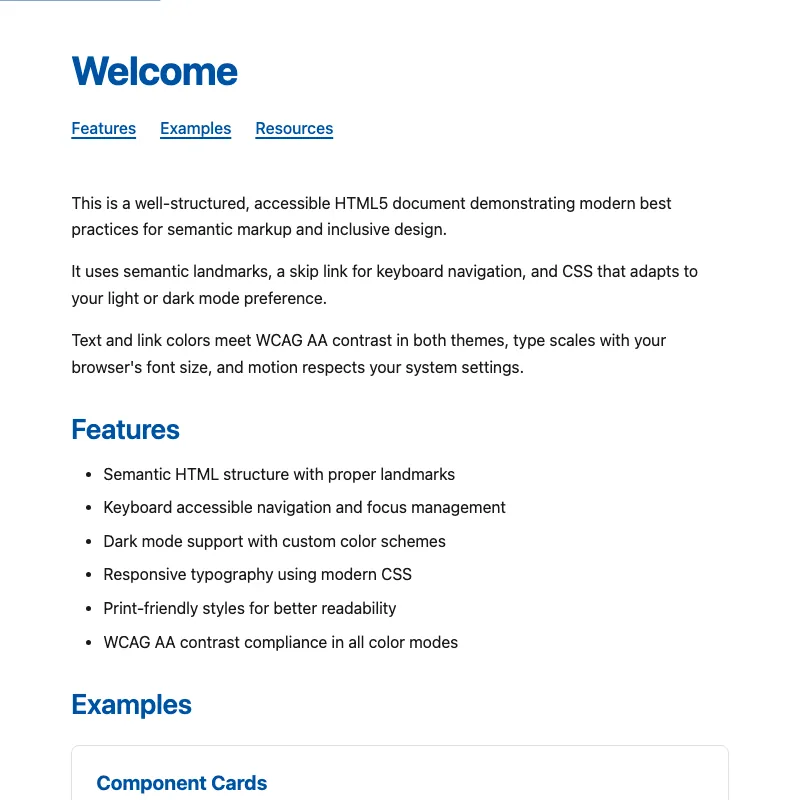
offline render, Chrome 154, light scheme, 2 s of virtual time
runs in a sandboxed frame with no origin; live pages may fetch CDN fonts the offline render did not
<!DOCTYPE html>
<html lang="en" dir="ltr">
<head>
<meta charset="utf-8">
<meta http-equiv="content-security-policy" content="default-src 'none'; script-src 'unsafe-inline'; style-src 'unsafe-inline'; img-src data:; base-uri 'none'; form-action 'none'">
<meta name="viewport" content="width=device-width, initial-scale=1, viewport-fit=cover">
<meta name="description" content="A well-structured, accessible HTML5 document with modern best practices.">
<meta name="color-scheme" content="light dark">
<meta name="theme-color" content="#ffffff" media="(prefers-color-scheme: light)">
<meta name="theme-color" content="#121212" media="(prefers-color-scheme: dark)">
<title>Welcome</title>
<link rel="icon" href="data:image/svg+xml,%3Csvg xmlns='http://www.w3.org/2000/svg' viewBox='0 0 100 100'%3E%3Ctext y='.9em' font-size='90'%3E👋%3C/text%3E%3C/svg%3E">
<style>
:root {
color-scheme: light dark;
--text: #1a1a1a;
--text-secondary: #555;
--background: #fff;
--surface: #fff;
--accent: #0052a3;
--border: #e0e0e0;
}
@media (prefers-color-scheme: dark) {
:root {
--text: #e0e0e0;
--text-secondary: #a0a0a0;
--background: #121212;
--surface: #1e1e1e;
--accent: #5fa3ff;
--border: #333;
}
}
*,
*::before,
*::after {
box-sizing: border-box;
}
html {
-webkit-text-size-adjust: 100%;
text-size-adjust: 100%;
}
@media (prefers-reduced-motion: no-preference) {
html {
scroll-behavior: smooth;
}
a {
transition: text-decoration-thickness 0.15s ease;
}
.skip-link {
transition: transform 0.15s ease;
}
button,
.button {
transition: opacity 0.15s ease, transform 0.15s ease;
}
}
body {
display: grid;
grid-template-columns: minmax(0, 1fr);
grid-template-rows: auto 1fr auto;
min-height: 100vh;
min-height: 100dvh;
font-family: system-ui, -apple-system, BlinkMacSystemFont, "Segoe UI", Roboto, sans-serif;
font-size: 1rem;
line-height: 1.6;
overflow-wrap: break-word;
max-width: 70ch;
margin: 0 auto;
padding-top: max(clamp(1rem, 5vw, 1.5rem), env(safe-area-inset-top));
padding-right: max(clamp(1rem, 5vw, 1.5rem), env(safe-area-inset-right));
padding-bottom: max(clamp(1rem, 5vw, 1.5rem), env(safe-area-inset-bottom));
padding-left: max(clamp(1rem, 5vw, 1.5rem), env(safe-area-inset-left));
color: var(--text);
background: var(--background);
}
h1 {
color: var(--accent);
font-size: clamp(1.75rem, 1.25rem + 3vw, 2.5rem);
font-weight: 700;
line-height: 1.1;
text-wrap: balance;
margin: 0 0 1.5rem 0;
letter-spacing: -0.02em;
}
h2 {
color: var(--accent);
font-size: clamp(1.25rem, 1rem + 1.5vw, 1.75rem);
font-weight: 600;
line-height: 1.2;
text-wrap: balance;
margin: 2rem 0 1rem 0;
letter-spacing: -0.01em;
}
h2:first-child {
margin-top: 0;
}
p {
text-wrap: pretty;
margin: 1rem 0;
line-height: 1.65;
}
a {
color: var(--accent);
text-underline-offset: 0.2em;
text-decoration-thickness: 2px;
text-decoration-skip-ink: auto;
font-weight: 500;
}
a:hover, a:active {
text-decoration-thickness: 3px;
}
button,
.button {
display: inline-block;
text-decoration: none;
padding: 0.75rem 1.5rem;
font-size: 1rem;
font-weight: 500;
font-family: inherit;
color: var(--background);
background: var(--accent);
border: 2px solid var(--accent);
border-radius: 0.25rem;
cursor: pointer;
white-space: nowrap;
}
button:hover,
.button:hover {
opacity: 0.85;
text-decoration: none;
}
button:active,
.button:active {
transform: scale(0.97);
}
ul, ol {
margin: 1rem 0;
padding-left: 2rem;
}
li {
margin: 0.5rem 0;
}
:focus-visible {
outline: 2px solid var(--accent);
outline-offset: 2px;
}
a:not(.button):focus-visible {
border-radius: 2px;
}
.skip-link {
position: absolute;
left: 0;
top: 0;
transform: translateY(-100%);
background: var(--accent);
color: var(--background);
padding: 0.75rem 1.5rem;
z-index: 1000;
border-radius: 0 0 0.25rem 0;
font-weight: 600;
text-decoration: none;
display: inline-block;
}
.skip-link:focus {
transform: none;
outline: 3px solid var(--text);
outline-offset: -3px;
}
header {
padding-block: 1.5rem 0;
}
header nav ul {
display: flex;
flex-wrap: wrap;
gap: 0.5rem 1.5rem;
margin: 1rem 0 0 0;
padding: 0;
list-style: none;
}
header nav li {
margin: 0;
}
main {
padding: 1rem 0;
}
main:focus {
outline: none;
}
section {
margin: 2rem 0;
}
[id] {
scroll-margin-top: 1.5rem;
}
@media (forced-colors: active) {
.skip-link,
button,
.button {
border: 2px solid ButtonText;
}
}
.card {
border: 1px solid var(--border);
border-radius: 0.5rem;
padding: 1.5rem;
background: var(--surface);
margin: 1.5rem 0;
}
.card h3 {
font-size: 1.25rem;
line-height: 1.3;
text-wrap: balance;
margin-top: 0;
margin-bottom: 0.5rem;
color: var(--accent);
}
.visually-hidden {
position: absolute;
width: 1px;
height: 1px;
margin: -1px;
padding: 0;
overflow: hidden;
clip: rect(0, 0, 0, 0);
white-space: nowrap;
border: 0;
}
@media (prefers-contrast: more) {
:root {
--border: currentColor;
}
button,
.button {
border-width: 3px;
}
.card {
border-width: 2px;
}
}
footer {
padding-block: 1.5rem;
border-top: 1px solid var(--border);
font-size: 0.875rem;
color: var(--text-secondary);
text-align: center;
}
footer p {
margin: 0.5rem 0;
}
small {
display: block;
}
.field {
margin-bottom: 1rem;
}
label {
display: block;
margin-bottom: 0.5rem;
font-weight: 500;
}
input,
textarea {
width: 100%;
padding: 0.5rem;
font: inherit;
color: var(--text);
background: var(--surface);
border: 1px solid var(--border);
border-radius: 0.25rem;
}
textarea {
resize: vertical;
}
#form-status:empty {
margin: 0;
}
.form-hint {
margin: 0 0 1rem 0;
font-size: 0.875rem;
color: var(--text-secondary);
}
input:user-invalid,
textarea:user-invalid {
border-color: #c62828;
border-width: 2px;
}
.live-region {
display: flex;
align-items: center;
min-height: 3.5rem;
margin-top: 1rem;
padding: 1rem;
border: 1px dashed var(--border);
border-radius: 0.25rem;
}
input:focus,
textarea:focus {
outline: 2px solid var(--accent);
outline-offset: 2px;
border-color: var(--accent);
}
@media print {
:root {
color-scheme: light;
--text: #000;
--text-secondary: #333;
--background: #fff;
--surface: #fff;
--accent: #000;
--border: #999;
}
.skip-link,
button,
.button {
display: none;
}
body {
display: block;
min-height: 0;
max-width: none;
padding: 0;
}
a {
color: inherit;
text-decoration: underline;
}
a[href^="http"]::after {
content: " (" attr(href) ")";
font-size: 0.85em;
font-weight: normal;
}
.card {
border: none;
break-inside: avoid;
}
}
</style>
</head>
<body>
<a class="skip-link" href="#main">Skip to content</a>
<header id="top">
<h1>Welcome</h1>
<nav aria-label="Page sections">
<ul>
<li><a href="#features">Features</a></li>
<li><a href="#examples">Examples</a></li>
<li><a href="#resources">Resources</a></li>
</ul>
</nav>
</header>
<main id="main" tabindex="-1">
<section aria-label="Introduction">
<p>This is a well-structured, accessible HTML5 document demonstrating modern best practices for semantic markup and inclusive design.</p>
<p>
It uses semantic landmarks, a skip link for keyboard navigation,
and CSS that adapts to your light or dark mode preference.
</p>
<p>
Text and link colors meet WCAG AA contrast in both themes, type scales
with your browser's font size, and motion respects your system settings.
</p>
</section>
<section aria-labelledby="features">
<h2 id="features">Features</h2>
<ul>
<li>Semantic HTML structure with proper landmarks</li>
<li>Keyboard accessible navigation and focus management</li>
<li>Dark mode support with custom color schemes</li>
<li>Responsive typography using modern CSS</li>
<li>Print-friendly styles for better readability</li>
<li>WCAG AA contrast compliance in all color modes</li>
</ul>
</section>
<section aria-labelledby="examples">
<h2 id="examples">Examples</h2>
<article class="card">
<h3>Component Cards</h3>
<p>Card components are useful for organizing related content. They include a subtle border and padding for visual separation.</p>
<a class="button" href="#resources">Learn more<span class="visually-hidden"> about accessibility resources</span></a>
</article>
<article class="card">
<h3>Interactive Elements</h3>
<p>Buttons and links are fully accessible with clear focus states. The “Learn more” button above demonstrates smooth transitions and proper visual feedback.</p>
<p>Try using the Tab key to navigate through all interactive elements.</p>
</article>
<article class="card">
<h3>Accessible Form</h3>
<form id="contact-form">
<p class="form-hint">Fields marked <span aria-hidden="true">*</span> are required.</p>
<div class="field">
<label for="email">Email <span aria-hidden="true">*</span><span class="visually-hidden"> (required)</span></label>
<input type="email" id="email" name="email" autocomplete="email" required>
</div>
<div class="field">
<label for="message">Message</label>
<textarea id="message" name="message" rows="4"></textarea>
</div>
<button type="submit">Send message</button>
<p id="form-status" role="status"></p>
</form>
</article>
<article class="card">
<h3>Live Region Example</h3>
<p>Click the button to announce a message using a live region. This demonstrates how screen readers are notified of dynamic updates.</p>
<button id="announce" type="button">Announce message</button>
<div class="live-region" aria-live="polite" aria-atomic="true">
<span id="live-message"></span>
</div>
</article>
</section>
<section aria-labelledby="resources">
<h2 id="resources">Resources</h2>
<p>Want to learn more about web accessibility and semantic HTML? Check out these resources:</p>
<ul>
<li><a href="https://www.w3.org/WAI/WCAG22/quickref/" target="_blank" rel="noopener noreferrer">WCAG 2.2 Quick Reference<span class="visually-hidden"> (opens in new tab)</span></a></li>
<li><a href="https://html.spec.whatwg.org/" target="_blank" rel="noopener noreferrer">HTML Living Standard<span class="visually-hidden"> (opens in new tab)</span></a></li>
<li><a href="https://www.a11y-101.com/" target="_blank" rel="noopener noreferrer">A11y 101<span class="visually-hidden"> (opens in new tab)</span></a></li>
</ul>
</section>
</main>
<footer>
<p><small>© <time datetime="2026">2026</time>. All rights reserved.</small></p>
<p><a href="#top">Back to top</a></p>
</footer>
<script>
const messages = [
"This update was announced to screen readers!",
"Dynamic content updates work with aria-live regions.",
"Live regions are essential for accessible web apps.",
"Try this with a screen reader like NVDA or JAWS!"
];
let nextMessage = 0;
document.getElementById('announce').addEventListener('click', () => {
document.getElementById('live-message').textContent = messages[nextMessage];
nextMessage = (nextMessage + 1) % messages.length;
});
document.getElementById('contact-form').addEventListener('submit', (event) => {
event.preventDefault();
const status = document.getElementById('form-status');
// Clear first so repeat submissions are re-announced
status.textContent = '';
setTimeout(() => {
status.textContent = "Thanks! This is a demo, so nothing was sent.";
}, 100);
});
</script>
</body>
</html>
what changed from step 030
+1 / -1 lines
<body> <a class="skip-link" href="#main">Skip to content</a>- <header>+ <header id="top"> <h1>Welcome</h1> <nav aria-label="Page sections">
What the model said
Fixed the "Back to top" link, which previously pointed to a nonexistent `#top` anchor and did nothing — now it targets the header. That was the one real bug in an otherwise solid, well-crafted accessible page.