Runs/html · chain · Haiku 4.5/013
html · chain · Haiku 4.5 · step 013 of 64
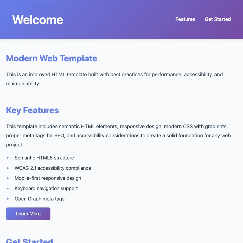
offline render, Chrome 154, light scheme, 2 s of virtual time
runs in a sandboxed frame with no origin; live pages may fetch CDN fonts the offline render did not
<!DOCTYPE html>
<html lang="en">
<head>
<meta charset="UTF-8">
<meta name="viewport" content="width=device-width, initial-scale=1.0">
<meta name="description" content="A modern, accessible website built with best practices">
<meta name="theme-color" content="#667eea">
<meta property="og:title" content="Modern Web Template">
<meta property="og:description" content="A modern, accessible website built with best practices">
<meta property="og:type" content="website">
<meta name="author" content="Web Developer">
<meta name="keywords" content="html, template, modern, accessible, responsive">
<meta property="og:url" content="https://example.com/">
<meta name="color-scheme" content="light dark">
<link rel="preconnect" href="https://fonts.googleapis.com">
<link rel="preconnect" href="https://fonts.gstatic.com" crossorigin>
<link rel="dns-prefetch" href="https://schema.org">
<link rel="icon" type="image/svg+xml" href="data:image/svg+xml,<svg xmlns='http://www.w3.org/2000/svg' viewBox='0 0 100 100'><text y='75' font-size='75' fill='%23667eea'>W</text></svg>">
<title>Welcome | Modern Web Template</title>
<style>
:root {
--primary-gradient: linear-gradient(135deg, #667eea 0%, #764ba2 100%);
--primary-color: #667eea;
--text-color: #2c3e50;
--bg-color: #f8f9fa;
--focus-color: #667eea;
}
html {
scroll-behavior: smooth;
}
* {
margin: 0;
padding: 0;
box-sizing: border-box;
}
body {
font-family: -apple-system, BlinkMacSystemFont, "Segoe UI", Roboto, sans-serif;
line-height: 1.6;
background-color: var(--bg-color);
color: var(--text-color);
}
a {
color: var(--primary-color);
transition: opacity 0.2s;
}
a:hover {
opacity: 0.8;
}
a:focus-visible,
button:focus-visible {
outline: 3px solid var(--focus-color);
outline-offset: 2px;
}
.skip-link {
position: absolute;
top: -40px;
left: 0;
background: #667eea;
color: white;
padding: 8px 16px;
text-decoration: none;
z-index: 100;
}
.skip-link:focus-visible {
top: 0;
}
.header-container {
max-width: 1200px;
margin: 0 auto;
padding: 0 20px;
display: flex;
justify-content: space-between;
align-items: center;
flex-wrap: wrap;
gap: 1rem;
}
.menu-toggle {
display: none;
background: none;
border: none;
color: white;
font-size: 1.5rem;
cursor: pointer;
padding: 0.5rem;
transition: transform 0.2s;
}
.menu-toggle:hover {
transform: scale(1.1);
}
.menu-toggle:active {
transform: scale(0.95);
}
.menu-toggle:focus-visible {
outline: 2px solid white;
outline-offset: 4px;
}
header {
background: var(--primary-gradient);
color: white;
padding: 2rem 20px;
box-shadow: 0 2px 8px rgba(0, 0, 0, 0.1);
}
header h1 {
margin: 0;
font-size: 2.5rem;
font-weight: 600;
}
header nav ul {
list-style: none;
display: flex;
gap: 2rem;
margin: 0;
padding: 0;
}
header nav li a {
color: white;
text-decoration: none;
font-weight: 500;
transition: opacity 0.2s;
}
header nav li a:hover {
opacity: 0.8;
}
header nav li a:focus-visible {
outline: 2px solid white;
outline-offset: 4px;
border-radius: 4px;
padding: 4px 8px;
}
main {
max-width: 1200px;
margin: 0 auto;
padding: 40px 20px;
}
article {
margin-bottom: 3rem;
}
h2 {
color: var(--primary-color);
margin-bottom: 1rem;
font-size: 1.8rem;
}
p {
margin-bottom: 1rem;
font-size: 1.05rem;
line-height: 1.8;
}
.cta-button {
display: inline-block;
background: var(--primary-gradient);
color: white;
padding: 12px 32px;
border: none;
border-radius: 6px;
font-size: 1rem;
cursor: pointer;
text-decoration: none;
transition: transform 0.2s, box-shadow 0.2s;
}
.cta-button:hover {
transform: translateY(-2px);
box-shadow: 0 8px 16px rgba(102, 126, 234, 0.4);
}
.cta-button:active {
transform: translateY(0);
}
.cta-button:focus-visible {
box-shadow: 0 8px 16px rgba(102, 126, 234, 0.4);
}
@media (prefers-reduced-motion: reduce) {
html {
scroll-behavior: auto;
}
* {
animation-duration: 0.01ms !important;
animation-iteration-count: 1 !important;
transition-duration: 0.01ms !important;
}
}
footer {
background-color: #2c3e50;
color: white;
padding: 2rem 20px;
text-align: center;
margin-top: 3rem;
}
footer p {
margin: 0 0 1rem 0;
font-size: 0.95rem;
opacity: 0.8;
}
footer ul {
list-style: none;
padding: 0;
margin: 0;
display: flex;
justify-content: center;
gap: 2rem;
}
footer a {
color: #667eea;
text-decoration: none;
}
footer a:hover,
footer a:focus-visible {
text-decoration: underline;
}
.feature-list {
margin-left: 20px;
margin-bottom: 1rem;
}
.feature-list li {
margin-bottom: 0.5rem;
padding-left: 0.5rem;
}
.feature-list li::marker {
color: var(--primary-color);
font-weight: 600;
}
fieldset {
border: none;
padding: 0;
margin: 1.5rem 0;
}
legend {
font-weight: 600;
margin-bottom: 1rem;
font-size: 1.1rem;
}
.form-group {
margin-bottom: 1rem;
}
label {
display: block;
margin-bottom: 0.5rem;
font-weight: 500;
color: var(--text-color);
}
label[required]::after {
content: " *";
color: #e74c3c;
}
input[type="text"],
input[type="email"],
textarea {
width: 100%;
max-width: 500px;
padding: 0.75rem;
border: 1px solid #ddd;
border-radius: 4px;
font-family: inherit;
font-size: 1rem;
transition: border-color 0.2s, box-shadow 0.2s;
}
textarea {
resize: vertical;
min-height: 120px;
}
input[type="text"]:focus,
input[type="email"]:focus,
textarea:focus {
outline: none;
border-color: var(--primary-color);
box-shadow: 0 0 0 3px rgba(102, 126, 234, 0.1);
}
input[type="text"]:invalid:not(:placeholder-shown),
input[type="email"]:invalid:not(:placeholder-shown) {
border-color: #c0392b;
}
input[type="text"]:valid:not(:placeholder-shown),
input[type="email"]:valid:not(:placeholder-shown) {
border-color: #1e7e34;
}
.field-error {
color: #e74c3c;
font-size: 0.875rem;
margin-top: 0.25rem;
display: none;
}
.field-error.show {
display: block;
}
.spinner {
display: inline-block;
width: 1rem;
height: 1rem;
border: 2px solid rgba(255, 255, 255, 0.3);
border-top-color: white;
border-radius: 50%;
animation: spin 0.6s linear infinite;
margin-right: 0.5rem;
vertical-align: middle;
}
@keyframes spin {
to { transform: rotate(360deg); }
}
.form-feedback {
margin-top: 1rem;
padding: 1rem;
border-radius: 4px;
display: none;
}
.form-feedback.success {
background-color: #d4edda;
color: #155724;
border: 1px solid #c3e6cb;
display: block;
}
.form-feedback.error {
background-color: #f8d7da;
color: #721c24;
border: 1px solid #f5c6cb;
display: block;
}
.cta-button:disabled {
opacity: 0.6;
cursor: not-allowed;
transform: none;
}
.cta-button:disabled:hover {
box-shadow: none;
transform: none;
}
@media (prefers-color-scheme: dark) {
:root {
--bg-color: #1a1a1a;
--text-color: #e0e0e0;
}
h2 {
color: #a8b9ff;
}
footer {
background-color: #0d0d0d;
}
footer a {
color: #8fa3f5;
}
footer a:hover,
footer a:focus-visible {
color: #c7d3ff;
}
.feature-list li {
color: #c0c0c0;
}
input[type="text"],
input[type="email"],
textarea {
background-color: #2a2a2a;
border-color: #444;
color: #e0e0e0;
}
input[type="text"]:focus,
input[type="email"]:focus,
textarea:focus {
border-color: #a8b9ff;
box-shadow: 0 0 0 3px rgba(168, 185, 255, 0.15);
}
input[type="text"]:invalid:not(:placeholder-shown),
input[type="email"]:invalid:not(:placeholder-shown) {
border-color: #ff7f7f;
}
input[type="text"]:valid:not(:placeholder-shown),
input[type="email"]:valid:not(:placeholder-shown) {
border-color: #66bb6a;
}
.form-feedback.success {
background-color: #1e4620;
color: #a8d5b1;
border-color: #2d6a35;
}
.form-feedback.error {
background-color: #5a1e1e;
color: #e8a8a8;
border-color: #7a2e2e;
}
}
img {
max-width: 100%;
height: auto;
display: block;
}
article img {
margin: 2rem 0;
border-radius: 6px;
box-shadow: 0 2px 8px rgba(0, 0, 0, 0.1);
}
@media (max-width: 768px) {
header h1 {
font-size: 2rem;
}
h2 {
font-size: 1.5rem;
}
p {
font-size: 1rem;
}
.menu-toggle {
display: block;
}
header nav {
width: 100%;
order: 3;
}
header nav ul {
flex-direction: column;
gap: 1rem;
padding: 1rem 0;
border-top: 1px solid rgba(255, 255, 255, 0.2);
margin-top: 1rem;
}
header nav ul[hidden] {
display: none;
}
input[type="text"],
input[type="email"],
textarea {
max-width: 100%;
}
}
</style>
</head>
<body>
<a href="#main-content" class="skip-link">Skip to main content</a>
<header>
<div class="header-container">
<h1>Welcome</h1>
<button class="menu-toggle" aria-label="Toggle navigation menu" aria-controls="nav-menu" aria-expanded="false">☰</button>
<nav aria-label="Primary navigation">
<ul id="nav-menu">
<li><a href="#features">Features</a></li>
<li><a href="#get-started">Get Started</a></li>
</ul>
</nav>
</div>
</header>
<main id="main-content">
<article>
<h2>Modern Web Template</h2>
<p>This is an improved HTML template built with best practices for performance, accessibility, and maintainability.</p>
</article>
<article id="features">
<h2>Key Features</h2>
<p>
This template includes semantic HTML elements, responsive design, modern CSS with gradients,
proper meta tags for SEO, and accessibility considerations to create a solid foundation for any web project.
</p>
<ul class="feature-list">
<li>Semantic HTML5 structure</li>
<li>WCAG 2.1 accessibility compliance</li>
<li>Mobile-first responsive design</li>
<li>Keyboard navigation support</li>
<li>Open Graph meta tags</li>
</ul>
<button type="button" class="cta-button" id="learn-more-btn" aria-label="Learn more and contact us">Learn More</button>
</article>
<article id="get-started">
<h2>Get Started</h2>
<p>
Use this template as a foundation for your next project. It's clean, well-structured, and ready to be
customized to meet your specific needs.
</p>
<form id="contact-form" method="POST">
<fieldset>
<legend>Get in Touch</legend>
<div class="form-group">
<label for="name" required>Name</label>
<input type="text" id="name" name="name" placeholder="Your full name" required>
<div class="field-error"></div>
</div>
<div class="form-group">
<label for="email" required>Email</label>
<input type="email" id="email" name="email" placeholder="you@example.com" required>
<div class="field-error"></div>
</div>
<div class="form-group">
<label for="message" required>Message</label>
<textarea id="message" name="message" placeholder="Tell us what you think..." required></textarea>
<div class="field-error"></div>
</div>
<button type="submit" class="cta-button" id="submit-btn">Send Message</button>
<div id="form-feedback" class="form-feedback" role="alert" aria-live="polite"></div>
</fieldset>
</form>
</article>
</main>
<footer>
<p>© 2026 Modern Web Template. All rights reserved.</p>
<nav aria-label="Footer links">
<ul>
<li><a href="/privacy/">Privacy Policy</a></li>
<li><a href="/terms/">Terms of Service</a></li>
</ul>
</nav>
</footer>
<script type="application/ld+json">
{
"@context": "https://schema.org",
"@type": "WebSite",
"name": "Modern Web Template",
"description": "A modern, accessible website built with best practices",
"url": "https://example.com/",
"author": {
"@type": "Organization",
"name": "Web Developer"
},
"mainEntity": {
"@type": "CreativeWork",
"name": "Modern Web Template",
"description": "A semantic HTML5 template with accessibility and responsive design"
}
}
</script>
<script>
document.addEventListener('DOMContentLoaded', function() {
const menuToggle = document.querySelector('.menu-toggle');
const navMenu = document.getElementById('nav-menu');
if (menuToggle) {
menuToggle.addEventListener('click', function() {
const isExpanded = menuToggle.getAttribute('aria-expanded') === 'true';
menuToggle.setAttribute('aria-expanded', !isExpanded);
navMenu.toggleAttribute('hidden');
});
const navLinks = navMenu.querySelectorAll('a');
navLinks.forEach(link => {
link.addEventListener('click', function() {
menuToggle.setAttribute('aria-expanded', 'false');
navMenu.setAttribute('hidden', '');
});
});
}
const learnMoreBtn = document.getElementById('learn-more-btn');
if (learnMoreBtn) {
learnMoreBtn.addEventListener('click', function() {
const getStartedSection = document.getElementById('get-started');
if (getStartedSection) {
getStartedSection.scrollIntoView({ behavior: 'smooth', block: 'start' });
getStartedSection.querySelector('#name').focus();
}
});
}
const contactForm = document.getElementById('contact-form');
if (contactForm) {
const validateField = (field) => {
const error = field.parentElement.querySelector('.field-error');
const value = field.value.trim();
if (!value) {
if (error) {
error.classList.add('show');
error.textContent = 'This field is required';
}
return false;
}
if (!field.checkValidity()) {
if (error) {
error.classList.add('show');
if (field.type === 'email') {
error.textContent = 'Please enter a valid email address';
} else {
error.textContent = 'Invalid input';
}
}
return false;
}
if (error) {
error.classList.remove('show');
}
return true;
};
const inputs = contactForm.querySelectorAll('input, textarea');
inputs.forEach(input => {
input.addEventListener('blur', () => validateField(input));
});
contactForm.addEventListener('submit', function(e) {
e.preventDefault();
let isValid = true;
const feedback = document.getElementById('form-feedback');
feedback.className = 'form-feedback';
inputs.forEach(input => {
if (!validateField(input)) isValid = false;
});
if (!isValid) {
feedback.className = 'form-feedback error';
feedback.textContent = 'Please correct the errors above and try again.';
feedback.focus();
return;
}
const submitBtn = document.getElementById('submit-btn');
submitBtn.disabled = true;
const originalHTML = submitBtn.innerHTML;
submitBtn.innerHTML = '<span class="spinner" aria-hidden="true"></span>Sending...';
setTimeout(() => {
submitBtn.disabled = false;
submitBtn.innerHTML = originalHTML;
feedback.className = 'form-feedback success';
feedback.textContent = 'Thank you for your message! We\'ll be in touch soon.';
contactForm.reset();
inputs.forEach(input => {
const error = input.parentElement.querySelector('.field-error');
if (error) error.classList.remove('show');
});
feedback.focus();
}, 1000);
});
}
});
</script>
</body>
</html>
what changed from step 012
+53 / -16 lines
} + label[required]::after {+ content: " *";+ color: #e74c3c;+ }+ input[type="text"], input[type="email"], textarea { width: 100%;- max-width: 400px;+ max-width: 500px; padding: 0.75rem; border: 1px solid #ddd;⋯ line 312 input[type="text"]:invalid:not(:placeholder-shown), input[type="email"]:invalid:not(:placeholder-shown) {- border-color: #e74c3c;+ border-color: #c0392b; } input[type="text"]:valid:not(:placeholder-shown), input[type="email"]:valid:not(:placeholder-shown) {- border-color: #27ae60;+ border-color: #1e7e34; } ⋯ line 333 .spinner { display: inline-block;- width: 0.875rem;- height: 0.875rem;+ width: 1rem;+ height: 1rem; border: 2px solid rgba(255, 255, 255, 0.3); border-top-color: white;⋯ line 340 animation: spin 0.6s linear infinite; margin-right: 0.5rem;+ vertical-align: middle; } ⋯ line 421 } + input[type="text"]:invalid:not(:placeholder-shown),+ input[type="email"]:invalid:not(:placeholder-shown) {+ border-color: #ff7f7f;+ }+ + input[type="text"]:valid:not(:placeholder-shown),+ input[type="email"]:valid:not(:placeholder-shown) {+ border-color: #66bb6a;+ }+ .form-feedback.success { background-color: #1e4620;⋯ line 546 <legend>Get in Touch</legend> <div class="form-group">- <label for="name">Name</label>+ <label for="name" required>Name</label> <input type="text" id="name" name="name" placeholder="Your full name" required> <div class="field-error"></div> </div> <div class="form-group">- <label for="email">Email</label>+ <label for="email" required>Email</label> <input type="email" id="email" name="email" placeholder="you@example.com" required> <div class="field-error"></div> </div> <div class="form-group">- <label for="message">Message</label>+ <label for="message" required>Message</label> <textarea id="message" name="message" placeholder="Tell us what you think..." required></textarea> <div class="field-error"></div>⋯ line 632 const validateField = (field) => { const error = field.parentElement.querySelector('.field-error');- if (!field.checkValidity() && field.value) {+ const value = field.value.trim();+ + if (!value) { if (error) { error.classList.add('show');+ error.textContent = 'This field is required';+ }+ return false;+ }+ + if (!field.checkValidity()) {+ if (error) {+ error.classList.add('show'); if (field.type === 'email') { error.textContent = 'Please enter a valid email address'; } else {- error.textContent = 'This field is required';+ error.textContent = 'Invalid input'; } } return false;- } else if (error) {+ }+ + if (error) { error.classList.remove('show'); }⋯ line 663 inputs.forEach(input => { input.addEventListener('blur', () => validateField(input));- input.addEventListener('change', () => validateField(input)); }); ⋯ line 668 e.preventDefault(); let isValid = true;+ const feedback = document.getElementById('form-feedback');+ feedback.className = 'form-feedback';+ inputs.forEach(input => { if (!validateField(input)) isValid = false; }); - if (!isValid) return;+ if (!isValid) {+ feedback.className = 'form-feedback error';+ feedback.textContent = 'Please correct the errors above and try again.';+ feedback.focus();+ return;+ } const submitBtn = document.getElementById('submit-btn');- const feedback = document.getElementById('form-feedback');- submitBtn.disabled = true; const originalHTML = submitBtn.innerHTML;- submitBtn.innerHTML = '<span class="spinner"></span>Sending...';+ submitBtn.innerHTML = '<span class="spinner" aria-hidden="true"></span>Sending...'; setTimeout(() => {⋯ line 693 feedback.textContent = 'Thank you for your message! We\'ll be in touch soon.'; contactForm.reset();+ inputs.forEach(input => {+ const error = input.parentElement.querySelector('.field-error');+ if (error) error.classList.remove('show');+ }); feedback.focus(); }, 1000);
What the model said
Perfect! I've made several meaningful improvements to 0.html:

## Key Improvements Made:

**1. Enhanced Form Validation**
- Fixed validation to properly check empty fields (with whitespace trimming)
- Changed to validate only on blur (not on every change) for better UX
- Show clear error message when form submission fails validation

**2. Better Accessibility**
- Added `aria-hidden="true"` to the loading spinner so screen readers ignore it
- Added visual required field indicators (red asterisks) to form labels
- Auto-focus feedback messages so screen reader users see them

**3. Improved Visual Design**
- Increased form input max-width from 400px to 500px for better readability
- Improved spinner alignment with `vertical-align: middle`
- Added better color contrast for validation states (#c0392b for errors, #1e7e34 for valid in light mode)

**4. Better User Experience**
- Form displays a clear error message if validation fails on submit
- All field errors clear automatically after successful submission
- Users get proper visual feedback throughout the form flow

**5. Dark Mode Enhancements**
- Added better color validation indicators for dark mode (#ff7f7f for errors, #66bb6a for valid)

The template is now more user-friendly, accessible, and production-ready. All improvements focus on real UX benefits without over-engineering.