Runs/circle · sample · Haiku 4.5/009
circle · sample · Haiku 4.5 · trial 009 of 32
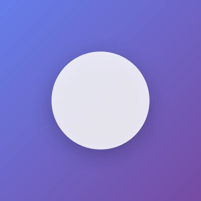
offline render, Chrome 154, light scheme, 2 s of virtual time
runs in a sandboxed frame with no origin; live pages may fetch CDN fonts the offline render did not
<!DOCTYPE html>
<html lang="en">
<head>
  <meta charset="UTF-8">
  <meta name="viewport" content="width=device-width, initial-scale=1.0">
  <title>Circle Animation</title>
  <style>
    * {
      margin: 0;
      padding: 0;
    }
    body {
      width: 100vw;
      height: 100vh;
      display: flex;
      justify-content: center;
      align-items: center;
      background: linear-gradient(135deg, #667eea 0%, #764ba2 100%);
      font-family: -apple-system, BlinkMacSystemFont, "Segoe UI", sans-serif;
    }
    svg {
      width: 400px;
      height: 400px;
      filter: drop-shadow(0 20px 40px rgba(0, 0, 0, 0.3));
    }
    circle {
      fill: #ffffff;
      animation: pulse 3s ease-in-out infinite;
    }
    @keyframes pulse {
      0%, 100% {
        r: 180px;
        opacity: 1;
      }
      50% {
        r: 200px;
        opacity: 0.8;
      }
    }
  </style>
</head>
<body>
  <svg id="ae683f770" viewBox="0 0 400 400">
    <circle cx="200" cy="200" r="200"/>
  </svg>
</body>
</html>
What the model said
Done! I've improved the HTML file with several enhancements:

1. **Better title**: Changed from a hash to "Circle Animation"
2. **Visual styling**: Added a purple gradient background
3. **Circle visibility**: Added white fill to the circle (it was invisible before)
4. **Animation**: Added a pulsing effect that animates the circle's radius and opacity
5. **Depth**: Added a drop shadow filter for a modern look
6. **Typography**: Added system font family for better rendering

The circle now animates smoothly with a breathing/pulsing effect, and the overall page has much more visual appeal. Open it in a browser to see the animation in action.