Runs/circle · chain · relay/046
circle · chain · relay · step 046 of 64
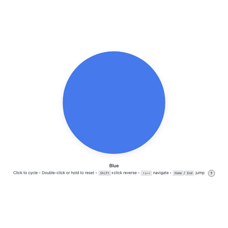
offline render, Chrome 154, light scheme, 2 s of virtual time
runs in a sandboxed frame with no origin; live pages may fetch CDN fonts the offline render did not
<!DOCTYPE html>
<html lang="en">
<head>
  <meta charset="UTF-8">
  <meta name="viewport" content="width=device-width, initial-scale=1.0">
  <meta name="color-scheme" content="light dark">
  <title>Animated Circle - Interactive Demo</title>
  <meta name="description" content="A responsive, accessible circle that changes color when clicked">
  <meta name="theme-color" content="#ffffff" media="(prefers-color-scheme: light)">
  <meta name="theme-color" content="#111111" media="(prefers-color-scheme: dark)">
  <link rel="icon" href="data:,">
  <style>
    *,
    *::before,
    *::after {
      box-sizing: border-box;
      margin: 0;
      padding: 0;
    }
    :root {
      color-scheme: light dark;
      --bg: #fff;
      --text: #374151;
      --fg: #2563eb;
      --shadow: rgba(0, 0, 0, 0.1);
      --kbd-bg: rgba(0, 0, 0, 0.1);
      --drop: drop-shadow(0 4px 12px var(--shadow));
    }
    [data-color="red"] { --fg: #dc2626; }
    /* Dark enough to keep 3:1 against --bg at the resting 0.85 opacity */
    [data-color="green"] { --fg: #15803d; }
    [data-color="amber"] { --fg: #b45309; }
    [data-color="violet"] { --fg: #7c3aed; }
    [data-color="cyan"] { --fg: #0e7490; }
    @media (prefers-color-scheme: dark) {
      :root {
        --bg: #111;
        --text: #d1d5db;
        --fg: #93c5fd;
        --shadow: rgba(0, 0, 0, 0.6);
        --kbd-bg: rgba(255, 255, 255, 0.15);
      }
      [data-color="red"] { --fg: #fca5a5; }
      [data-color="green"] { --fg: #86efac; }
      [data-color="amber"] { --fg: #fcd34d; }
      [data-color="violet"] { --fg: #c4b5fd; }
      [data-color="cyan"] { --fg: #67e8f9; }
    }
    @media (prefers-contrast: more) {
      :root {
        --shadow: rgba(0, 0, 0, 0.9);
        --drop: drop-shadow(0 2px 8px var(--shadow));
      }
      .circle svg {
        opacity: 1;
      }
    }
    @media (forced-colors: active) {
      svg circle {
        stroke: CanvasText;
        stroke-width: 2;
      }
    }
    body {
      min-height: 100vh;
      min-height: 100dvh;
      display: grid;
      place-items: center;
      padding: 1rem;
      background: var(--bg);
      color: var(--text);
      font-family: system-ui, -apple-system, sans-serif;
    }
    main {
      width: 100%;
      display: flex;
      flex-direction: column;
      align-items: center;
      text-align: center;
    }
    .circle {
      display: block;
      width: min(360px, 100%, 60vh);
      aspect-ratio: 1;
      border: 0;
      border-radius: 50%;
      background: none;
      color: var(--fg);
      cursor: pointer;
      touch-action: manipulation;
      -webkit-tap-highlight-color: transparent;
      /* Shift+click and double-click would otherwise select the text below */
      -webkit-user-select: none;
      user-select: none;
      -webkit-touch-callout: none;
      transition: color 0.4s ease;
      min-height: 48px;
      min-width: 48px;
    }
    .no-transition,
    .no-transition svg {
      transition: none !important;
    }
    .circle:focus-visible {
      outline: 3px solid currentColor;
      outline-offset: 12px;
    }
    svg {
      display: block;
      width: 100%;
      height: 100%;
      overflow: visible;
      opacity: 0.85;
      filter: var(--drop);
      transition: opacity 0.3s ease;
    }
    .circle:active svg,
    .circle:focus-visible svg {
      opacity: 1;
    }
    @keyframes pulse {
      0% {
        filter: var(--drop) drop-shadow(0 0 16px currentColor);
      }
      100% {
        filter: var(--drop) drop-shadow(0 0 0 transparent);
      }
    }
    @media (hover: hover) {
      .circle:hover svg {
        opacity: 1;
      }
    }
    @media (prefers-reduced-motion: no-preference) {
      svg {
        transition:
          transform 0.3s cubic-bezier(0.34, 1.56, 0.64, 1),
          opacity 0.3s ease;
      }
      .circle:focus-visible svg {
        transform: scale(1.05);
      }
      .circle:active svg {
        transform: scale(0.97);
      }
      .circle.color-changed svg {
        animation: pulse 0.5s ease-out;
      }
    }
    @media (hover: hover) and (prefers-reduced-motion: no-preference) {
      .circle:hover:not(:active) svg {
        transform: scale(1.05);
      }
    }
    .visually-hidden {
      position: absolute;
      width: 1px;
      height: 1px;
      overflow: hidden;
      clip-path: inset(50%);
      white-space: nowrap;
    }
    .status {
      margin-top: 2rem;
      font-weight: 600;
    }
    .hint {
      margin-top: 0.25rem;
      font-size: 0.875rem;
      line-height: 1.75;
      text-wrap: balance;
    }
    .help-button {
      margin-left: 0.5rem;
      display: inline-block;
      width: 1.5rem;
      height: 1.5rem;
      border-radius: 50%;
      background: var(--kbd-bg);
      border: 1px solid var(--text);
      color: var(--text);
      cursor: pointer;
      font: inherit;
      font-size: 0.75rem;
      font-weight: bold;
      line-height: 1;
      text-align: center;
      vertical-align: middle;
      touch-action: manipulation;
      transition: background-color 0.2s ease, color 0.2s ease;
    }
    .help-button:focus-visible {
      outline: 2px solid currentColor;
      outline-offset: 2px;
    }
    @media (hover: hover) {
      /* Not currentColor: it would resolve to the hover color and hide the "?" */
      .help-button:hover {
        background: var(--text);
        color: var(--bg);
      }
    }
    .keys {
      display: none;
    }
    .keys.visible {
      display: inline;
    }
    @media (hover: none) and (pointer: coarse) {
      .hint .keys {
        display: none !important;
      }
      .help-button {
        display: none;
      }
    }
    kbd {
      display: inline-block;
      padding: 0.125rem 0.375rem;
      background: var(--kbd-bg);
      border: 1px solid transparent;
      border-radius: 0.25rem;
      font-family: monospace;
      font-size: 0.75em;
      line-height: 1.2;
    }
  </style>
</head>
<body>
  <main>
    <h1 class="visually-hidden">Animated Circle</h1>
    <button type="button" class="circle no-transition" aria-label="Change circle color" aria-describedby="status hint">
      <svg viewBox="0 0 100 100" aria-hidden="true" focusable="false" xmlns="http://www.w3.org/2000/svg">
        <circle cx="50" cy="50" r="50" fill="currentColor" stroke="none"/>
      </svg>
    </button>
    <p class="status" id="status" role="status">Blue</p>
    <p class="hint"><span id="hint"><span class="verb">Click</span> to cycle • <span class="double-verb">Double-click</span> or hold to reset<span class="keys" id="keys"> • <kbd>Shift</kbd>+click reverse • <kbd>↑↓←→</kbd> navigate • <kbd>Home</kbd>/<kbd>End</kbd> jump</span></span> <button type="button" class="help-button" aria-label="Keyboard shortcuts" aria-expanded="false" aria-controls="keys"><span aria-hidden="true">?</span></button></p>
    <noscript><p class="hint">JavaScript is required to change the color.</p></noscript>
  </main>
  <script>
    const config = {
      colors: ['blue', 'red', 'green', 'amber', 'violet', 'cyan'],
      storageKey: 'circle-color',
      hapticDuration: 50,
      longPressDuration: 500,
      keySteps: { ArrowRight: 1, ArrowDown: 1, ArrowLeft: -1, ArrowUp: -1 },
    };

    const DOM = {
      button: document.querySelector('.circle'),
      status: document.querySelector('.status'),
      helpButton: document.querySelector('.help-button'),
      keyHint: document.querySelector('.keys'),
      verbSpan: document.querySelector('.hint .verb'),
      doubleVerbSpan: document.querySelector('.hint .double-verb'),
    };

    const state = {
      index: 0,
      shiftHeld: false,
      hoverCapable: true,
      reducedMotion: matchMedia('(prefers-reduced-motion: reduce)'),
      hoverQuery: matchMedia('(hover: none)'),
      longPressTimer: null,
      longPressed: false,
    };

    function loadColor() {
      try {
        return localStorage.getItem(config.storageKey);
      } catch {
        return null;
      }
    }

    function saveColor(color) {
      try {
        localStorage.setItem(config.storageKey, color);
      } catch {}
    }

    function applyColor() {
      const color = config.colors[state.index];
      DOM.button.dataset.color = color === 'blue' ? '' : color;
      DOM.status.textContent = color[0].toUpperCase() + color.slice(1);
    }

    function syncFromStorage(color = loadColor()) {
      const index = config.colors.indexOf(color);
      state.index = index === -1 ? 0 : index;
      applyColor();
    }

    function setIndex(next, { haptic = false } = {}) {
      if (next === state.index) return;
      state.index = next;
      applyColor();
      saveColor(config.colors[state.index]);

      if (haptic && navigator.vibrate) navigator.vibrate(config.hapticDuration);

      if (state.reducedMotion.matches) return;
      DOM.button.classList.remove('color-changed');
      void DOM.button.offsetWidth;
      DOM.button.classList.add('color-changed');
    }

    function changeColor(step) {
      setIndex((state.index + step + config.colors.length) % config.colors.length, { haptic: true });
    }

    function updateDeviceVerbs() {
      state.hoverCapable = !state.hoverQuery.matches;
      DOM.verbSpan.textContent = state.hoverCapable ? 'Click' : 'Tap';
      DOM.doubleVerbSpan.textContent = state.hoverCapable ? 'Double-click' : 'Double-tap';
    }

    function toggleKeyHintVisibility() {
      const expanded = DOM.keyHint.classList.toggle('visible');
      DOM.helpButton.setAttribute('aria-expanded', expanded);
    }

    function syncKeyHint() {
      DOM.keyHint.classList.toggle('visible', state.hoverCapable);
      DOM.helpButton.setAttribute('aria-expanded', state.hoverCapable);
    }

    function handleKeyDown(event) {
      if (event.key === 'Enter' || event.key === ' ') {
        if (!event.repeat) state.shiftHeld = event.shiftKey;
        if (event.key === 'Enter' && event.repeat) event.preventDefault();
        return;
      }

      if (event.altKey || event.ctrlKey || event.metaKey) return;

      if (event.key in config.keySteps) {
        event.preventDefault();
        changeColor(config.keySteps[event.key]);
      } else if (event.key === 'Home') {
        event.preventDefault();
        setIndex(0, { haptic: true });
      } else if (event.key === 'End') {
        event.preventDefault();
        setIndex(config.colors.length - 1, { haptic: true });
      }
    }

    // Initialize
    syncFromStorage();

    requestAnimationFrame(() => requestAnimationFrame(() => {
      DOM.button.classList.remove('no-transition');
    }));

    updateDeviceVerbs();
    syncKeyHint();
    // e.g. a tablet gaining or losing a trackpad/keyboard
    state.hoverQuery.addEventListener('change', () => {
      updateDeviceVerbs();
      syncKeyHint();
    });

    // Event listeners
    function clearLongPressTimer() {
      if (state.longPressTimer) clearTimeout(state.longPressTimer);
      state.longPressTimer = null;
    }

    DOM.button.addEventListener('keydown', handleKeyDown);
    DOM.button.addEventListener('keyup', (event) => {
      if (event.key === ' ') state.shiftHeld = event.shiftKey;
    });
    DOM.button.addEventListener('blur', () => {
      state.shiftHeld = false;
      clearLongPressTimer();
    });
    DOM.button.addEventListener('pointerdown', (event) => {
      clearLongPressTimer();
      state.longPressed = false;
      if (!event.isPrimary || event.button !== 0) return;
      state.longPressTimer = setTimeout(() => {
        state.longPressTimer = null;
        state.longPressed = true;
        // Still confirm the gesture when already reset, since the release click is swallowed
        if (state.index === 0 && navigator.vibrate) navigator.vibrate(config.hapticDuration);
        setIndex(0, { haptic: true });
      }, config.longPressDuration);
    });
    // Android fires contextmenu on a touch hold, racing the long-press reset
    DOM.button.addEventListener('contextmenu', (event) => {
      if (state.longPressTimer || state.longPressed) event.preventDefault();
    });
    DOM.button.addEventListener('pointerup', clearLongPressTimer);
    DOM.button.addEventListener('pointercancel', clearLongPressTimer);
    DOM.button.addEventListener('pointerleave', clearLongPressTimer);
    DOM.button.addEventListener('click', (event) => {
      clearLongPressTimer();
      // Releasing a long press still fires a click, which would undo the reset.
      // Keyboard clicks (detail 0) are never part of a long press.
      const afterLongPress = state.longPressed && event.detail !== 0;
      state.longPressed = false;
      if (afterLongPress || event.detail > 1) return;
      changeColor(event.shiftKey || state.shiftHeld ? -1 : 1);
      state.shiftHeld = false;
    });
    DOM.button.addEventListener('dblclick', (event) => {
      event.preventDefault();
      setIndex(0);
    });
    DOM.button.addEventListener('animationend', () => {
      DOM.button.classList.remove('color-changed');
    });

    DOM.helpButton.addEventListener('click', toggleKeyHintVisibility);

    addEventListener('storage', (event) => {
      if (event.key !== config.storageKey && event.key !== null) return;
      syncFromStorage(event.newValue);
    });
    // Storage events are not delivered while the page sits in the bfcache
    addEventListener('pageshow', (event) => {
      if (event.persisted) syncFromStorage();
    });
  </script>
</body>
</html>
what changed from step 045
+6 / -0 lines
state.longPressTimer = null; state.longPressed = true;+ // Still confirm the gesture when already reset, since the release click is swallowed+ if (state.index === 0 && navigator.vibrate) navigator.vibrate(config.hapticDuration); setIndex(0, { haptic: true }); }, config.longPressDuration);+ });+ // Android fires contextmenu on a touch hold, racing the long-press reset+ DOM.button.addEventListener('contextmenu', (event) => {+ if (state.longPressTimer || state.longPressed) event.preventDefault(); }); DOM.button.addEventListener('pointerup', clearLongPressTimer);
What the model said
I fixed two problems with holding down on the circle, both in `0.html`. I haven't tested either change in a browser.

1. **Android menu on hold:** On Android, holding a finger on the circle opens the system context menu at about the same moment as the reset, and gets in its way. I now block that menu only while a hold is in progress or has just finished. Right-clicking with a mouse is unaffected, because a right-click never starts the hold timer.
2. **No feedback when already blue:** Holding the circle while it was already blue did nothing you could feel. It didn't vibrate, and the click on release was ignored on purpose, so the hold seemed to fail. It now vibrates anyway to confirm the hold registered.

I left everything else alone because it was already solid. If you had something specific in mind, like a visual redesign, more colors or new features, tell me and I'll do that.