Runs/circle · chain · relay/007
circle · chain · relay · step 007 of 64
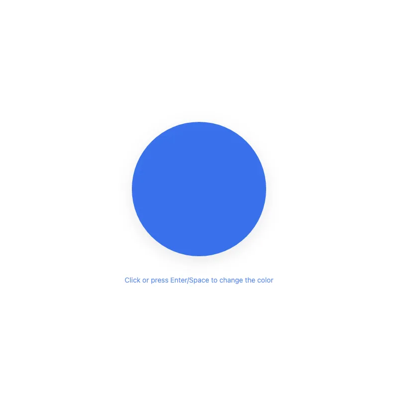
offline render, Chrome 154, light scheme, 2 s of virtual time
runs in a sandboxed frame with no origin; live pages may fetch CDN fonts the offline render did not
<!DOCTYPE html>
<html lang="en">
<head>
  <meta charset="UTF-8">
  <meta name="viewport" content="width=device-width, initial-scale=1.0">
  <meta name="color-scheme" content="light dark">
  <title>Animated Circle - Interactive Demo</title>
  <meta name="description" content="A responsive, accessible animated circle with hover effects">
  <style>
    *,
    *::before,
    *::after {
      box-sizing: border-box;
      margin: 0;
      padding: 0;
    }
    :root {
      --bg: #fff;
      --fg: #2563eb;
      --shadow: rgba(0, 0, 0, 0.1);
    }
    @media (prefers-color-scheme: dark) {
      :root {
        --bg: #111;
        --fg: #60a5fa;
        --shadow: rgba(0, 0, 0, 0.6);
      }
    }
    @media (prefers-contrast: more) {
      :root {
        --shadow: rgba(0, 0, 0, 0.9);
      }
    }
    .hint {
      margin-top: 1.5rem;
      font-size: 0.875rem;
      text-align: center;
      opacity: 0.7;
    }
    body {
      min-height: 100dvh;
      display: grid;
      place-items: center;
      padding: 1rem;
      background: var(--bg);
      color: var(--fg);
      font-family: system-ui, -apple-system, sans-serif;
    }
    main {
      width: 100%;
      display: flex;
      justify-content: center;
    }
    svg {
      display: block;
      width: min(400px, 100%);
      height: auto;
      overflow: visible;
      filter: drop-shadow(0 8px 16px var(--shadow));
    }
    circle {
      transition: opacity 0.3s ease;
      transform-box: fill-box;
      transform-origin: center;
      opacity: 0.9;
    }
    svg:focus {
      outline: none;
    }
    svg:focus-visible {
      outline: 3px solid var(--fg);
      outline-offset: 8px;
      border-radius: 50%;
    }
    @media (hover: hover) {
      circle:hover {
        opacity: 1;
      }
    }
    circle:active,
    svg:focus-visible circle {
      opacity: 1;
    }
    @media (prefers-reduced-motion: no-preference) {
      circle {
        transition:
          transform 0.3s cubic-bezier(0.34, 1.56, 0.64, 1),
          opacity 0.3s ease;
      }
      circle:active,
      svg:focus-visible circle {
        transform: scale(1.05);
      }
    }
    @media (hover: hover) and (prefers-reduced-motion: no-preference) {
      circle:hover {
        transform: scale(1.05);
      }
    }
  </style>
</head>
<body>
  <main>
    <div>
      <svg viewBox="0 0 400 400" role="button" aria-labelledby="circle-title" tabindex="0" xmlns="http://www.w3.org/2000/svg">
        <title id="circle-title">Colored circle. Click or press Enter/Space to change its color. Grows slightly on hover or focus.</title>
        <circle cx="200" cy="200" r="180" fill="currentColor"/>
      </svg>
      <p class="hint">Click or press Enter/Space to change the color</p>
    </div>
  </main>
  <script>
    const svg = document.querySelector('svg');
    const colors = ['#2563eb', '#dc2626', '#16a34a', '#d97706', '#7c3aed', '#0891b2'];
    let index = 0;

    function cycleColor() {
      index = (index + 1) % colors.length;
      svg.style.color = colors[index];
    }

    svg.addEventListener('click', cycleColor);
    svg.addEventListener('keydown', (e) => {
      if (e.key === 'Enter' || e.key === ' ') {
        e.preventDefault();
        cycleColor();
      }
    });
  </script>
</body>
</html>
what changed from step 006
+36 / -4 lines
} }+ @media (prefers-contrast: more) {+ :root {+ --shadow: rgba(0, 0, 0, 0.9);+ }+ }+ .hint {+ margin-top: 1.5rem;+ font-size: 0.875rem;+ text-align: center;+ opacity: 0.7;+ } body { min-height: 100dvh;⋯ line 102 <body> <main>- <svg viewBox="0 0 400 400" role="img" aria-labelledby="circle-title" tabindex="0" xmlns="http://www.w3.org/2000/svg">- <title id="circle-title">Blue circle that grows slightly on hover or focus</title>- <circle cx="200" cy="200" r="180" fill="currentColor"/>- </svg>+ <div>+ <svg viewBox="0 0 400 400" role="button" aria-labelledby="circle-title" tabindex="0" xmlns="http://www.w3.org/2000/svg">+ <title id="circle-title">Colored circle. Click or press Enter/Space to change its color. Grows slightly on hover or focus.</title>+ <circle cx="200" cy="200" r="180" fill="currentColor"/>+ </svg>+ <p class="hint">Click or press Enter/Space to change the color</p>+ </div> </main>+ <script>+ const svg = document.querySelector('svg');+ const colors = ['#2563eb', '#dc2626', '#16a34a', '#d97706', '#7c3aed', '#0891b2'];+ let index = 0;+ + function cycleColor() {+ index = (index + 1) % colors.length;+ svg.style.color = colors[index];+ }+ + svg.addEventListener('click', cycleColor);+ svg.addEventListener('keydown', (e) => {+ if (e.key === 'Enter' || e.key === ' ') {+ e.preventDefault();+ cycleColor();+ }+ });+ </script> </body> </html>
What the model said
I couldn't open the file in a browser to visually verify (the `open` command was blocked in this session), so please open `0.html` yourself to confirm it looks/behaves as expected.

What changed:
- Circle is now genuinely interactive — click or press Enter/Space to cycle through 6 colors, matching the "Interactive Demo" title (`role="button"` on the SVG, updated title text for screen readers).
- Added a visible hint text below the circle.
- Added `prefers-contrast: more` support for a stronger shadow in high-contrast mode.