Runs/circle · chain · Haiku 4.5/027
circle · chain · Haiku 4.5 · step 027 of 64
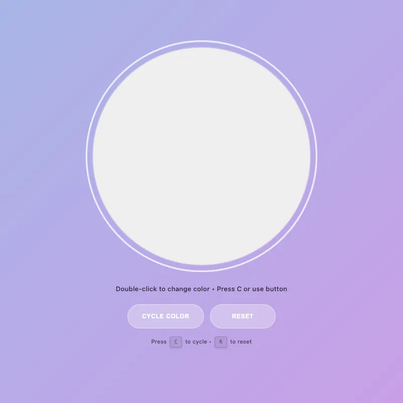
offline render, Chrome 154, light scheme, 2 s of virtual time
runs in a sandboxed frame with no origin; live pages may fetch CDN fonts the offline render did not
<!DOCTYPE html>
<html lang="en">
<head>
  <meta charset="UTF-8">
  <meta name="viewport" content="width=device-width, initial-scale=1.0">
  <meta name="description" content="Interactive color-changing circle with smooth animations. Click to activate, double-click to cycle through 4 vibrant colors. Full keyboard and touch support.">
  <meta name="theme-color" content="#5f6fd1" media="(prefers-color-scheme: dark)">
  <meta name="theme-color" content="#a8b5e8" media="(prefers-color-scheme: light)">
  <meta name="color-scheme" content="light dark">
  <title>Interactive Circle - Color Demo</title>
  <style>
    :root {
      --color-white: #ffffff;
      --color-gold: #ffd700;
      --color-pink: #ff6b9d;
      --color-teal: #4ecdc4;
      --color-mint: #95e1d3;
      --shadow-color: rgba(0, 0, 0, 0.3);
      --transition-normal: 0.3s ease;
      --transition-slow: 0.6s ease-out;
      --pulse-duration: 2.5s;
      --color-mode-1-rgb: 255, 107, 157;
      --color-mode-2-rgb: 78, 205, 196;
      --color-mode-3-rgb: 149, 225, 211;
    }

    * {
      margin: 0;
      padding: 0;
      box-sizing: border-box;
    }
    html, body {
      width: 100%;
      height: 100%;
      overflow: hidden;
    }
    body {
      display: flex;
      flex-direction: column;
      justify-content: center;
      align-items: center;
      gap: 20px;
      background: linear-gradient(135deg, #5f6fd1 0%, #6b3fa0 100%);
      font-family: -apple-system, BlinkMacSystemFont, "Segoe UI", Roboto, sans-serif;
      color: var(--color-white);
      font-size: 14px;
      padding: 20px;
      min-height: 100vh;
    }
    .circle-container {
      cursor: pointer;
      border: none;
      background: none;
      padding: 0;
      position: relative;
      contain: layout style paint;
      transition: transform var(--transition-normal);
      user-select: none;
      touch-action: manipulation;
      -webkit-tap-highlight-color: transparent;
    }
    .circle-container:hover {
      transform: scale(1.05);
    }
    .circle-container:focus {
      outline: none;
    }
    .circle-container:focus-visible {
      transform: scale(1.08);
      outline: 3px solid rgba(255, 255, 255, 0.8);
      outline-offset: 10px;
      border-radius: 50%;
      box-shadow: 0 0 0 1px rgba(255, 255, 255, 0.3);
    }
    svg {
      width: min(400px, 80vw);
      height: min(400px, 80vw);
      display: block;
      animation: fadeIn var(--transition-slow);
    }
    circle {
      fill: var(--color-white);
      stroke: rgba(255, 255, 255, 0.25);
      stroke-width: 1.5;
      animation: pulse var(--pulse-duration) ease-in-out infinite;
      filter: drop-shadow(0 20px 40px var(--shadow-color));
      transition: fill 0.3s cubic-bezier(0.34, 1.56, 0.64, 1), r 0.3s ease, stroke 0.3s ease, filter 0.3s ease;
      will-change: fill, r, filter;
    }
    .circle-container:is(:hover, :focus-visible) circle {
      fill: #e8f4f8;
      r: 205;
      stroke: rgba(255, 255, 255, 0.4);
    }
    .circle-container.active:not([class*="color-mode-"]) circle {
      fill: var(--color-gold);
      stroke: rgba(255, 215, 0, 0.3);
      animation: pulse-active 0.6s ease-in-out;
      filter: drop-shadow(0 20px 40px rgba(255, 215, 0, 0.5));
      r: 200;
    }

    .circle-container.color-mode-1 { --mode-color: var(--color-pink); --mode-rgb: var(--color-mode-1-rgb); }
    .circle-container.color-mode-2 { --mode-color: var(--color-teal); --mode-rgb: var(--color-mode-2-rgb); }
    .circle-container.color-mode-3 { --mode-color: var(--color-mint); --mode-rgb: var(--color-mode-3-rgb); }

    [class*="color-mode-"] circle {
      fill: var(--mode-color);
      stroke: rgba(var(--mode-rgb), 0.3);
      filter: drop-shadow(0 20px 40px rgba(var(--mode-rgb), 0.3));
    }
    [class*="color-mode-"]:is(:hover, :focus-visible) circle {
      stroke: rgba(var(--mode-rgb), 0.5);
    }
    [class*="color-mode-"].active circle {
      animation: pulse-active 0.6s ease-in-out;
      filter: drop-shadow(0 20px 40px rgba(var(--mode-rgb), 0.5));
    }

    .hint {
      font-size: 13px;
      opacity: 0.95;
      transition: opacity var(--transition-normal);
      letter-spacing: 0.3px;
      max-width: 95%;
      line-height: 1.5;
      margin-top: 2px;
      position: relative;
      text-shadow: 0 1px 4px rgba(0, 0, 0, 0.4);
      font-weight: 500;
    }

    .mode-indicator {
      font-size: 11px;
      opacity: 0;
      margin-top: 6px;
      letter-spacing: 1px;
      text-transform: uppercase;
      transition: opacity var(--transition-normal), transform 0.3s ease;
      height: 18px;
      font-weight: 600;
      transform: scale(0.95);
    }
    .mode-indicator.visible {
      opacity: 0.95;
      transform: scale(1);
    }

    .controls {
      display: flex;
      gap: 12px;
      margin-top: 6px;
      flex-wrap: wrap;
      justify-content: center;
      width: 100%;
    }

    .control-btn {
      padding: 12px 28px;
      font-size: 12px;
      font-weight: 600;
      letter-spacing: 0.6px;
      text-transform: uppercase;
      background: rgba(255, 255, 255, 0.18);
      color: var(--color-white);
      border: 1.5px solid rgba(255, 255, 255, 0.35);
      border-radius: 24px;
      cursor: pointer;
      transition: all var(--transition-normal);
      backdrop-filter: blur(4px);
      outline: none;
      min-height: 48px;
      min-width: 130px;
      display: flex;
      align-items: center;
      justify-content: center;
      user-select: none;
      -webkit-tap-highlight-color: transparent;
    }

    .control-btn:hover {
      background: rgba(255, 255, 255, 0.28);
      border-color: rgba(255, 255, 255, 0.6);
      transform: translateY(-2px);
      box-shadow: 0 8px 16px rgba(0, 0, 0, 0.2);
    }

    .control-btn:active {
      transform: translateY(0) scale(0.95);
      box-shadow: 0 2px 4px rgba(0, 0, 0, 0.15);
    }

    .control-btn:focus-visible {
      outline: 2px solid rgba(255, 255, 255, 0.8);
      outline-offset: 6px;
    }

    .control-btn:disabled {
      opacity: 0.5;
      cursor: not-allowed;
    }
    @keyframes pulse {
      0%, 100% { r: 200; opacity: 0.96; }
      50% { r: 202; opacity: 1; }
    }
    @keyframes pulse-active {
      0% { r: 200; }
      50% { r: 208; }
      100% { r: 200; }
    }
    @keyframes fadeIn {
      from { opacity: 0; transform: scale(0.95); }
      to { opacity: 1; transform: scale(1); }
    }
    @keyframes colorShift {
      0% { r: 200; filter: saturate(1) brightness(1); }
      50% { r: 210; filter: saturate(1.3) brightness(1.1); }
      100% { r: 200; filter: saturate(1) brightness(1); }
    }
    .circle-container.color-shifting circle {
      animation: colorShift 0.5s cubic-bezier(0.34, 1.56, 0.64, 1);
    }
    .keyboard-hint {
      font-size: 11px;
      opacity: 0.8;
      margin-top: 2px;
      letter-spacing: 0.2px;
      transition: opacity var(--transition-normal);
      font-weight: 500;
    }
    .keyboard-hint kbd {
      background: rgba(255, 255, 255, 0.15);
      border: 1.5px solid rgba(255, 255, 255, 0.35);
      border-radius: 4px;
      padding: 3px 8px;
      font-family: 'Monaco', 'Courier New', monospace;
      font-size: 10px;
      font-weight: 600;
      display: inline-block;
      margin: 0 3px;
      box-shadow: 0 2px 4px rgba(0, 0, 0, 0.15);
    }
    @media (pointer: coarse) {
      .keyboard-hint {
        display: none;
      }
    }
    main {
      display: flex;
      flex-direction: column;
      align-items: center;
      justify-content: center;
      gap: 14px;
      text-align: center;
      width: 100%;
      flex: 1;
    }

    @media (max-width: 600px) {
      svg {
        width: min(330px, 75vw);
        height: min(330px, 75vw);
      }
      .hint {
        font-size: 12px;
      }
      .control-btn {
        padding: 14px 24px;
        font-size: 11px;
        min-height: 48px;
      }
    }
    @media (max-width: 480px) {
      body {
        gap: 12px;
        padding: 16px;
      }
      .mode-indicator {
        font-size: 9px;
      }
    }
    @media (max-width: 360px) {
      body {
        gap: 10px;
        padding: 14px;
      }
      svg {
        width: min(290px, 72vw);
        height: min(290px, 72vw);
      }
      .controls {
        flex-wrap: wrap;
      }
      .mode-indicator {
        font-size: 10px;
      }
      .hint {
        font-size: 11px;
      }
      .keyboard-hint {
        font-size: 10px;
      }
      .keyboard-hint kbd {
        padding: 3px 7px;
        font-size: 9px;
      }
    }
    @media (prefers-reduced-motion: reduce) {
      * {
        animation: none !important;
        transition: none !important;
      }
    }
    @supports (backdrop-filter: blur(0)) {
      .control-btn {
        background: rgba(255, 255, 255, 0.1);
      }
    }
    @supports not (backdrop-filter: blur(0)) {
      .control-btn {
        background: rgba(0, 0, 0, 0.3);
      }
    }
    @media (prefers-color-scheme: light) {
      body {
        background: linear-gradient(135deg, #a8b5e8 0%, #c99fe6 100%);
      }
      circle {
        fill: #ffffff;
        stroke: rgba(0, 0, 0, 0.12);
      }
      .circle-container:is(:hover, :focus-visible) circle {
        fill: #f0f0f0;
        stroke: rgba(0, 0, 0, 0.2);
      }
      .control-btn {
        background: rgba(255, 255, 255, 0.3);
        border-color: rgba(255, 255, 255, 0.5);
      }
      .control-btn:hover {
        background: rgba(255, 255, 255, 0.4);
        border-color: rgba(255, 255, 255, 0.7);
      }
      .hint {
        opacity: 0.99;
        color: rgba(0, 0, 0, 0.75);
        text-shadow: none;
      }
      .keyboard-hint {
        opacity: 0.85;
        color: rgba(0, 0, 0, 0.7);
      }
      .keyboard-hint kbd {
        background: rgba(0, 0, 0, 0.08);
        border-color: rgba(0, 0, 0, 0.2);
      }
    }
  </style>
</head>
<body>
  <main>
    <button type="button" class="circle-container" id="decorative-circle" aria-label="Interactive circle - click to activate, double-click or tap twice to change color" aria-pressed="false" aria-describedby="hint-text">
      <svg viewBox="0 0 400 400" aria-hidden="true" role="presentation">
        <circle cx="200" cy="200" r="200"/>
      </svg>
    </button>
    <div class="mode-indicator" id="mode-indicator" aria-live="polite" aria-atomic="true"></div>
    <div class="hint" id="hint-text" role="status" aria-live="polite" aria-relevant="text">Click or tap to activate</div>
    <div class="controls" role="group" aria-label="Circle controls">
      <button type="button" class="control-btn" id="cycle-btn" aria-label="Cycle to next color">Cycle Color</button>
      <button type="button" class="control-btn" id="reset-btn" aria-label="Reset to default state">Reset</button>
    </div>
    <div class="keyboard-hint" aria-label="Keyboard shortcuts">Press <kbd>C</kbd> to cycle • <kbd>R</kbd> to reset</div>
  </main>

  <script defer>
    const CONFIG = {
      storageKey: 'circle-state',
      tapDelay: 300,
      colorShiftDuration: 500,
      colorModes: [
        { class: 'default', name: 'Default White' },
        { class: 'color-mode-1', name: 'Pink' },
        { class: 'color-mode-2', name: 'Teal' },
        { class: 'color-mode-3', name: 'Mint' }
      ],
      isTouch: 'ontouchstart' in window || navigator.maxTouchPoints > 0,
      pulseInterval: 2500
    };

    const el = {
      circle: document.getElementById('decorative-circle'),
      hint: document.getElementById('hint-text'),
      modeIndicator: document.getElementById('mode-indicator'),
      cycleBtn: document.getElementById('cycle-btn'),
      resetBtn: document.getElementById('reset-btn')
    };

    let state = { active: false, colorMode: 0 };
    let tapCount = 0;
    let tapTimeout = null;
    let animatingColorShift = false;

    const getColorModeClass = (mode) => CONFIG.colorModes[mode % CONFIG.colorModes.length].class;
    const getColorModeName = (mode) => CONFIG.colorModes[mode % CONFIG.colorModes.length].name;

    const storage = {
      save() {
        try {
          localStorage.setItem(CONFIG.storageKey, JSON.stringify(state));
        } catch {
          // Silently fail if localStorage is unavailable or quota exceeded
        }
      },
      load() {
        try {
          const saved = localStorage.getItem(CONFIG.storageKey);
          if (saved) {
            const parsed = JSON.parse(saved);
            if (parsed && typeof parsed === 'object') {
              state = { ...state, ...parsed };
            }
          }
        } catch {
          // Silently fail if parsing fails
        }
      }
    };

    const updateClasses = () => {
      const colorClasses = CONFIG.colorModes.map(m => m.class);
      el.circle.classList.remove('active', ...colorClasses);
      el.circle.setAttribute('aria-pressed', state.active);
      if (state.active) el.circle.classList.add('active');
      if (state.colorMode > 0) el.circle.classList.add(getColorModeClass(state.colorMode));
    };

    const updateUI = () => {
      let hintText = state.active ? 'Active! ' : '';

      if (CONFIG.isTouch) {
        hintText += state.active ? 'Tap to cycle colors' : 'Tap or tap twice to change color';
      } else {
        hintText += state.active ? 'Double-click to cycle • Press C or use button' : 'Double-click to change color • Press C or use button';
      }

      el.hint.textContent = hintText;

      const showMode = state.active && state.colorMode > 0;
      el.modeIndicator.classList.toggle('visible', showMode);
      if (showMode) {
        const modeName = getColorModeName(state.colorMode);
        el.modeIndicator.textContent = `${modeName.toUpperCase()} MODE`;
      }
    };

    const applyState = () => {
      updateClasses();
      updateUI();
    };

    const toggleActive = () => {
      state.active = !state.active;
      applyState();
      storage.save();
    };

    const cycleColor = () => {
      if (animatingColorShift) return;
      animatingColorShift = true;
      state.colorMode = (state.colorMode + 1) % CONFIG.colorModes.length;
      state.active = true;
      el.circle.classList.add('color-shifting');
      setTimeout(() => {
        el.circle.classList.remove('color-shifting');
        animatingColorShift = false;
      }, CONFIG.colorShiftDuration);
      applyState();
      storage.save();
    };

    const resetState = () => {
      state = { active: false, colorMode: 0 };
      applyState();
      storage.save();
    };

    const handleDblClick = (e) => {
      e.preventDefault();
      if (!state.active) {
        state.active = true;
        applyState();
      }
      cycleColor();
    };

    const handleTouchEnd = () => {
      tapCount++;
      clearTimeout(tapTimeout);
      if (tapCount === 1) {
        tapTimeout = setTimeout(() => {
          if (tapCount === 1) toggleActive();
          tapCount = 0;
        }, CONFIG.tapDelay);
      } else if (tapCount === 2) {
        cycleColor();
        tapCount = 0;
      }
    };

    const keyHandlers = {
      ' ': toggleActive,
      'enter': toggleActive,
      'c': cycleColor,
      'r': resetState
    };

    const handleKeyDown = (e) => {
      const handler = keyHandlers[e.key.toLowerCase()];
      if (handler) {
        e.preventDefault();
        handler();
      }
    };

    const initListeners = () => {
      el.circle.addEventListener('click', toggleActive);
      el.circle.addEventListener('dblclick', handleDblClick);
      el.circle.addEventListener('touchend', handleTouchEnd);
      el.circle.addEventListener('blur', () => {
        tapCount = 0;
        clearTimeout(tapTimeout);
      });
      document.addEventListener('keydown', handleKeyDown);
      el.cycleBtn.addEventListener('click', cycleColor);
      el.resetBtn.addEventListener('click', resetState);
    };

    const initApp = () => {
      storage.load();
      applyState();
      initListeners();
      requestAnimationFrame(() => el.circle.focus());
    };

    if (document.readyState === 'loading') {
      document.addEventListener('DOMContentLoaded', initApp);
    } else {
      initApp();
    }
  </script>
</body>
</html>
what changed from step 026
+21 / -15 lines
} .circle-container:hover {- transform: scale(1.06);+ transform: scale(1.05); } .circle-container:focus {⋯ line 157 .control-btn {- padding: 11px 24px;+ padding: 12px 28px; font-size: 12px; font-weight: 600;⋯ line 170 backdrop-filter: blur(4px); outline: none;- min-height: 44px;- min-width: 120px;+ min-height: 48px;+ min-width: 130px; display: flex; align-items: center;⋯ line 220 .circle-container.color-shifting circle { animation: colorShift 0.5s cubic-bezier(0.34, 1.56, 0.64, 1);- transform-origin: center; } .keyboard-hint {⋯ line 266 } .control-btn {- padding: 12px 22px;+ padding: 14px 24px; font-size: 11px;+ min-height: 48px; } }⋯ line 343 } .hint {- opacity: 0.98;+ opacity: 0.99;+ color: rgba(0, 0, 0, 0.75);+ text-shadow: none; } .keyboard-hint {- opacity: 0.8;+ opacity: 0.85;+ color: rgba(0, 0, 0, 0.7); }+ .keyboard-hint kbd {+ background: rgba(0, 0, 0, 0.08);+ border-color: rgba(0, 0, 0, 0.2);+ } } </style>⋯ line 360 <body> <main>- <button type="button" class="circle-container" id="decorative-circle" aria-label="Interactive circle - press Space to toggle, double-click to change color" aria-pressed="false" aria-describedby="hint-text">+ <button type="button" class="circle-container" id="decorative-circle" aria-label="Interactive circle - click to activate, double-click or tap twice to change color" aria-pressed="false" aria-describedby="hint-text"> <svg viewBox="0 0 400 400" aria-hidden="true" role="presentation"> <circle cx="200" cy="200" r="200"/>⋯ line 366 </button> <div class="mode-indicator" id="mode-indicator" aria-live="polite" aria-atomic="true"></div>- <div class="hint" id="hint-text" role="status" aria-live="polite" aria-relevant="text">Click to activate • Double-click to change color</div>+ <div class="hint" id="hint-text" role="status" aria-live="polite" aria-relevant="text">Click or tap to activate</div> <div class="controls" role="group" aria-label="Circle controls"> <button type="button" class="control-btn" id="cycle-btn" aria-label="Cycle to next color">Cycle Color</button>⋯ line 437 const updateUI = () => {- const mainText = state.active ? 'Active!' : 'Click to activate';- let hintParts = [mainText];+ let hintText = state.active ? 'Active! ' : ''; if (CONFIG.isTouch) {- hintParts.push(state.active ? 'Tap to change color' : 'Tap twice to change color');+ hintText += state.active ? 'Tap to cycle colors' : 'Tap or tap twice to change color'; } else {- hintParts.push(state.active ? 'Double-click to cycle colors' : 'Double-click to change color');+ hintText += state.active ? 'Double-click to cycle • Press C or use button' : 'Double-click to change color • Press C or use button'; } - el.hint.textContent = hintParts.join(' • ');+ el.hint.textContent = hintText; const showMode = state.active && state.colorMode > 0;
What the model said
I've improved the 0.html file with several enhancements:

**Key improvements made:**

1. **Accessibility**: Updated the circle button's aria-label to accurately describe all interaction methods (click, double-click, tap, tap twice)

2. **UX & Clarity**:
   - Simplified the initial hint text for clearer guidance
   - Enhanced dynamic hint text that updates more helpfully as you interact with the circle
   - Now shows available actions contextually based on whether the circle is active

3. **Visual Polish**:
   - Increased control button sizing (min-height 44px → 48px, better padding)
   - Improved light mode contrast - darker text color and better kbd styling
   - Removed redundant CSS (`transform-origin: center`)
   - Subtle hover scale adjustment (1.06 → 1.05) for smoother interaction

4. **Mobile UX**: Enhanced button padding on smaller screens (600px breakpoint) to improve tap targets and touchability

5. **Code Quality**: Cleaned up CSS redundancies while maintaining all visual effects

The improvements maintain all existing functionality while making the interface more intuitive, accessible, and polished. You can test by opening the file in a browser to see the smoother interactions and clearer guidance text.