Runs/circle · chain · Haiku 4.5/025
circle · chain · Haiku 4.5 · step 025 of 64
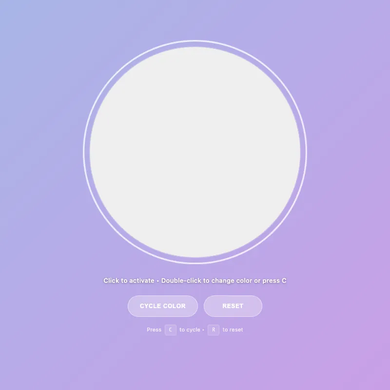
offline render, Chrome 154, light scheme, 2 s of virtual time
runs in a sandboxed frame with no origin; live pages may fetch CDN fonts the offline render did not
<!DOCTYPE html>
<html lang="en">
<head>
  <meta charset="UTF-8">
  <meta name="viewport" content="width=device-width, initial-scale=1.0">
  <meta name="description" content="An interactive color-changing circle with keyboard and touch controls">
  <meta name="theme-color" content="#5f6fd1" media="(prefers-color-scheme: dark)">
  <meta name="theme-color" content="#a8b5e8" media="(prefers-color-scheme: light)">
  <title>Circle Display</title>
  <style>
    :root {
      --color-white: #ffffff;
      --color-gold: #ffd700;
      --color-pink: #ff6b9d;
      --color-teal: #4ecdc4;
      --color-mint: #95e1d3;
      --shadow-color: rgba(0, 0, 0, 0.3);
      --transition-normal: 0.3s ease;
      --transition-slow: 0.6s ease-out;
      --pulse-duration: 2.5s;
      --color-mode-1-rgb: 255, 107, 157;
      --color-mode-2-rgb: 78, 205, 196;
      --color-mode-3-rgb: 149, 225, 211;
    }

    * {
      margin: 0;
      padding: 0;
      box-sizing: border-box;
    }
    html, body {
      width: 100%;
      height: 100%;
      overflow: hidden;
    }
    body {
      display: flex;
      flex-direction: column;
      justify-content: center;
      align-items: center;
      gap: 20px;
      background: linear-gradient(135deg, #5f6fd1 0%, #6b3fa0 100%);
      font-family: -apple-system, BlinkMacSystemFont, "Segoe UI", Roboto, sans-serif;
      color: var(--color-white);
      font-size: 14px;
      padding: 20px;
      min-height: 100vh;
    }
    .circle-container {
      cursor: pointer;
      border: none;
      background: none;
      padding: 0;
      position: relative;
      contain: layout style paint;
      transition: transform var(--transition-normal);
    }
    .circle-container:hover {
      transform: scale(1.06);
    }
    .circle-container:focus {
      outline: none;
    }
    .circle-container:focus-visible {
      transform: scale(1.08);
      outline: 3px solid rgba(255, 255, 255, 0.8);
      outline-offset: 10px;
      border-radius: 50%;
      box-shadow: 0 0 0 1px rgba(255, 255, 255, 0.3);
    }
    svg {
      width: min(400px, 80vw);
      height: min(400px, 80vw);
      display: block;
      animation: fadeIn var(--transition-slow);
    }
    circle {
      fill: var(--color-white);
      stroke: rgba(255, 255, 255, 0.25);
      stroke-width: 1.5;
      animation: pulse var(--pulse-duration) ease-in-out infinite;
      filter: drop-shadow(0 20px 40px var(--shadow-color));
      transition: fill 0.3s ease, r 0.3s ease, stroke 0.3s ease, filter 0.3s ease;
      will-change: r;
    }
    .circle-container:is(:hover, :focus-visible) circle {
      fill: #e8f4f8;
      r: 205;
      stroke: rgba(255, 255, 255, 0.4);
    }
    .circle-container.active:not([class*="color-mode-"]) circle {
      fill: var(--color-gold);
      stroke: rgba(255, 215, 0, 0.3);
      animation: pulse-active 0.6s ease-in-out;
      filter: drop-shadow(0 20px 40px rgba(255, 215, 0, 0.5));
      r: 200;
    }

    .circle-container.color-mode-1 { --mode-color: var(--color-pink); --mode-rgb: var(--color-mode-1-rgb); }
    .circle-container.color-mode-2 { --mode-color: var(--color-teal); --mode-rgb: var(--color-mode-2-rgb); }
    .circle-container.color-mode-3 { --mode-color: var(--color-mint); --mode-rgb: var(--color-mode-3-rgb); }

    [class*="color-mode-"] circle {
      fill: var(--mode-color);
      stroke: rgba(var(--mode-rgb), 0.3);
      filter: drop-shadow(0 20px 40px rgba(var(--mode-rgb), 0.3));
    }
    [class*="color-mode-"]:is(:hover, :focus-visible) circle {
      stroke: rgba(var(--mode-rgb), 0.5);
    }
    [class*="color-mode-"].active circle {
      animation: pulse-active 0.6s ease-in-out;
      filter: drop-shadow(0 20px 40px rgba(var(--mode-rgb), 0.5));
    }

    .hint {
      font-size: 13px;
      opacity: 0.95;
      transition: opacity var(--transition-normal);
      letter-spacing: 0.3px;
      max-width: 95%;
      line-height: 1.5;
      margin-top: 2px;
      position: relative;
      text-shadow: 0 1px 4px rgba(0, 0, 0, 0.4);
      font-weight: 500;
    }

    .mode-indicator {
      font-size: 11px;
      opacity: 0;
      margin-top: 6px;
      letter-spacing: 1px;
      text-transform: uppercase;
      transition: opacity var(--transition-normal), transform 0.3s ease;
      height: 18px;
      font-weight: 600;
      transform: scale(0.95);
    }
    .mode-indicator.visible {
      opacity: 0.95;
      transform: scale(1);
    }

    .controls {
      display: flex;
      gap: 12px;
      margin-top: 6px;
      flex-wrap: wrap;
      justify-content: center;
      width: 100%;
    }

    .control-btn {
      padding: 11px 24px;
      font-size: 12px;
      font-weight: 600;
      letter-spacing: 0.6px;
      text-transform: uppercase;
      background: rgba(255, 255, 255, 0.18);
      color: var(--color-white);
      border: 1.5px solid rgba(255, 255, 255, 0.35);
      border-radius: 24px;
      cursor: pointer;
      transition: all var(--transition-normal);
      backdrop-filter: blur(4px);
      outline: none;
      min-height: 44px;
      min-width: 120px;
      display: flex;
      align-items: center;
      justify-content: center;
    }

    .control-btn:hover {
      background: rgba(255, 255, 255, 0.28);
      border-color: rgba(255, 255, 255, 0.6);
      transform: translateY(-2px);
      box-shadow: 0 8px 16px rgba(0, 0, 0, 0.2);
    }

    .control-btn:active {
      transform: translateY(0) scale(0.95);
      box-shadow: 0 2px 4px rgba(0, 0, 0, 0.15);
    }

    .control-btn:focus-visible {
      outline: 2px solid rgba(255, 255, 255, 0.8);
      outline-offset: 6px;
    }

    .control-btn:disabled {
      opacity: 0.5;
      cursor: not-allowed;
    }
    @keyframes pulse {
      0%, 100% { r: 200; opacity: 0.96; }
      50% { r: 202; opacity: 1; }
    }
    @keyframes pulse-active {
      0% { r: 200; }
      50% { r: 208; }
      100% { r: 200; }
    }
    @keyframes fadeIn {
      from { opacity: 0; transform: scale(0.95); }
      to { opacity: 1; transform: scale(1); }
    }
    @keyframes colorShift {
      0% { filter: saturate(1) brightness(1); }
      50% { filter: saturate(1.25) brightness(1.08); }
      100% { filter: saturate(1) brightness(1); }
    }
    .circle-container.color-shifting circle {
      animation: colorShift 0.5s cubic-bezier(0.34, 1.56, 0.64, 1);
      transform-origin: center;
    }
    .keyboard-hint {
      font-size: 11px;
      opacity: 0.75;
      margin-top: 2px;
      letter-spacing: 0.2px;
      transition: opacity var(--transition-normal);
    }
    .keyboard-hint kbd {
      background: rgba(255, 255, 255, 0.15);
      border: 1px solid rgba(255, 255, 255, 0.3);
      border-radius: 4px;
      padding: 3px 8px;
      font-family: 'Monaco', 'Courier New', monospace;
      font-size: 10px;
      font-weight: 500;
      display: inline-block;
      margin: 0 3px;
    }
    @media (pointer: coarse) {
      .keyboard-hint {
        display: none;
      }
    }
    main {
      display: flex;
      flex-direction: column;
      align-items: center;
      justify-content: center;
      gap: 14px;
      text-align: center;
      width: 100%;
      flex: 1;
    }

    @media (max-width: 600px) {
      svg {
        width: min(330px, 75vw);
        height: min(330px, 75vw);
      }
      .hint {
        font-size: 12px;
      }
      .control-btn {
        padding: 12px 22px;
        font-size: 11px;
      }
    }
    @media (max-width: 480px) {
      body {
        gap: 12px;
        padding: 16px;
      }
      .mode-indicator {
        font-size: 9px;
      }
    }
    @media (max-width: 360px) {
      body {
        gap: 10px;
        padding: 14px;
      }
      svg {
        width: min(290px, 72vw);
        height: min(290px, 72vw);
      }
      .controls {
        flex-wrap: wrap;
      }
      .mode-indicator {
        font-size: 10px;
      }
      .hint {
        font-size: 11px;
      }
      .keyboard-hint {
        font-size: 10px;
      }
      .keyboard-hint kbd {
        padding: 3px 7px;
        font-size: 9px;
      }
    }
    @media (prefers-reduced-motion: reduce) {
      * {
        animation: none !important;
        transition: none !important;
      }
    }
    @supports (backdrop-filter: blur(0)) {
      .control-btn {
        background: rgba(255, 255, 255, 0.1);
      }
    }
    @supports not (backdrop-filter: blur(0)) {
      .control-btn {
        background: rgba(0, 0, 0, 0.3);
      }
    }
    @media (prefers-color-scheme: light) {
      body {
        background: linear-gradient(135deg, #a8b5e8 0%, #c99fe6 100%);
      }
      circle {
        fill: #ffffff;
        stroke: rgba(0, 0, 0, 0.12);
      }
      .circle-container:is(:hover, :focus-visible) circle {
        fill: #f0f0f0;
        stroke: rgba(0, 0, 0, 0.2);
      }
      .control-btn {
        background: rgba(255, 255, 255, 0.3);
        border-color: rgba(255, 255, 255, 0.5);
      }
      .control-btn:hover {
        background: rgba(255, 255, 255, 0.4);
        border-color: rgba(255, 255, 255, 0.7);
      }
      .hint {
        opacity: 0.98;
      }
      .keyboard-hint {
        opacity: 0.8;
      }
    }
  </style>
</head>
<body>
  <main>
    <button type="button" class="circle-container" id="decorative-circle" aria-label="Interactive circle - press Space to toggle, double-click to change color" aria-pressed="false">
      <svg viewBox="0 0 400 400" aria-hidden="true" role="presentation">
        <circle cx="200" cy="200" r="200"/>
      </svg>
    </button>
    <div class="mode-indicator" id="mode-indicator" aria-live="polite" aria-atomic="true"></div>
    <div class="hint" id="hint-text" role="status" aria-live="polite" aria-relevant="text">Click to activate • Double-click to change color</div>
    <div class="controls" role="group" aria-label="Circle controls">
      <button type="button" class="control-btn" id="cycle-btn" aria-label="Cycle to next color">Cycle Color</button>
      <button type="button" class="control-btn" id="reset-btn" aria-label="Reset to default state">Reset</button>
    </div>
    <div class="keyboard-hint" aria-label="Keyboard shortcuts">Press <kbd>C</kbd> to cycle • <kbd>R</kbd> to reset</div>
  </main>

  <script defer>
    const CONFIG = {
      storageKey: 'circle-state',
      tapDelay: 300,
      colorShiftDuration: 500,
      colorModes: [
        { class: 'default', name: 'Default White' },
        { class: 'color-mode-1', name: 'Pink' },
        { class: 'color-mode-2', name: 'Teal' },
        { class: 'color-mode-3', name: 'Mint' }
      ],
      isTouch: 'ontouchstart' in window || navigator.maxTouchPoints > 0,
      pulseInterval: 2500
    };

    const el = {
      circle: document.getElementById('decorative-circle'),
      hint: document.getElementById('hint-text'),
      modeIndicator: document.getElementById('mode-indicator'),
      cycleBtn: document.getElementById('cycle-btn'),
      resetBtn: document.getElementById('reset-btn')
    };

    let state = { active: false, colorMode: 0 };
    let tapCount = 0;
    let tapTimeout = null;
    let animatingColorShift = false;

    const getColorModeClass = (mode) => CONFIG.colorModes[mode % CONFIG.colorModes.length].class;
    const getColorModeName = (mode) => CONFIG.colorModes[mode % CONFIG.colorModes.length].name;

    const storage = {
      save() {
        try {
          localStorage.setItem(CONFIG.storageKey, JSON.stringify(state));
        } catch {
          // Silently fail if localStorage is unavailable or quota exceeded
        }
      },
      load() {
        try {
          const saved = localStorage.getItem(CONFIG.storageKey);
          if (saved) {
            const parsed = JSON.parse(saved);
            if (parsed && typeof parsed === 'object') {
              state = { ...state, ...parsed };
            }
          }
        } catch {
          // Silently fail if parsing fails
        }
      }
    };

    const updateClasses = () => {
      const colorClasses = CONFIG.colorModes.map(m => m.class);
      el.circle.classList.remove('active', ...colorClasses);
      el.circle.setAttribute('aria-pressed', state.active);
      if (state.active) el.circle.classList.add('active');
      if (state.colorMode > 0) el.circle.classList.add(getColorModeClass(state.colorMode));
    };

    const updateUI = () => {
      const mainText = state.active ? 'Active!' : 'Click to activate';
      let hintParts = [mainText];

      if (CONFIG.isTouch) {
        hintParts.push(state.active ? 'Tap to change color' : 'Tap twice to change color');
      } else {
        hintParts.push('Double-click to change color or press C');
      }

      el.hint.textContent = hintParts.join(' • ');

      const showMode = state.active && state.colorMode > 0;
      el.modeIndicator.classList.toggle('visible', showMode);
      if (showMode) {
        const modeName = getColorModeName(state.colorMode);
        el.modeIndicator.textContent = `${modeName} — Press R to reset`;
      }
    };

    const applyState = () => {
      updateClasses();
      updateUI();
    };

    const toggleActive = () => {
      state.active = !state.active;
      applyState();
      storage.save();
    };

    const cycleColor = () => {
      if (animatingColorShift) return;
      animatingColorShift = true;
      state.colorMode = (state.colorMode + 1) % CONFIG.colorModes.length;
      state.active = true;
      el.circle.classList.add('color-shifting');
      setTimeout(() => {
        el.circle.classList.remove('color-shifting');
        animatingColorShift = false;
      }, CONFIG.colorShiftDuration);
      applyState();
      storage.save();
    };

    const resetState = () => {
      state = { active: false, colorMode: 0 };
      applyState();
      storage.save();
    };

    const handleDblClick = (e) => {
      e.preventDefault();
      cycleColor();
    };

    const handleTouchEnd = () => {
      tapCount++;
      clearTimeout(tapTimeout);
      if (tapCount === 1) {
        tapTimeout = setTimeout(() => {
          if (tapCount === 1) toggleActive();
          tapCount = 0;
        }, CONFIG.tapDelay);
      } else if (tapCount === 2) {
        cycleColor();
        tapCount = 0;
      }
    };

    const keyHandlers = {
      ' ': toggleActive,
      'enter': toggleActive,
      'c': cycleColor,
      'r': resetState
    };

    const handleKeyDown = (e) => {
      const handler = keyHandlers[e.key.toLowerCase()];
      if (handler) {
        e.preventDefault();
        handler();
      }
    };

    const initListeners = () => {
      el.circle.addEventListener('click', toggleActive);
      el.circle.addEventListener('dblclick', handleDblClick);
      el.circle.addEventListener('touchend', handleTouchEnd);
      el.circle.addEventListener('blur', () => {
        tapCount = 0;
        clearTimeout(tapTimeout);
      });
      document.addEventListener('keydown', handleKeyDown);
      el.cycleBtn.addEventListener('click', cycleColor);
      el.resetBtn.addEventListener('click', resetState);
    };

    const initApp = () => {
      storage.load();
      applyState();
      initListeners();
      requestAnimationFrame(() => el.circle.focus());
    };

    if (document.readyState === 'loading') {
      document.addEventListener('DOMContentLoaded', initApp);
    } else {
      initApp();
    }
  </script>
</body>
</html>
what changed from step 024
+9 / -8 lines
backdrop-filter: blur(4px); outline: none;+ min-height: 44px;+ min-width: 120px;+ display: flex;+ align-items: center;+ justify-content: center; } ⋯ line 212 100% { filter: saturate(1) brightness(1); } }- .color-shifting circle {+ .circle-container.color-shifting circle { animation: colorShift 0.5s cubic-bezier(0.34, 1.56, 0.64, 1); transform-origin: center;⋯ line 261 padding: 12px 22px; font-size: 11px;- min-height: 44px;- display: flex;- align-items: center;- justify-content: center; } }⋯ line 359 </main> - <script>+ <script defer> const CONFIG = { storageKey: 'circle-state',⋯ line 428 hintParts.push(state.active ? 'Tap to change color' : 'Tap twice to change color'); } else {- hintParts.push('Double-click to change color');+ hintParts.push('Double-click to change color or press C'); } ⋯ line 437 if (showMode) { const modeName = getColorModeName(state.colorMode);- el.modeIndicator.textContent = modeName;+ el.modeIndicator.textContent = `${modeName} — Press R to reset`; } };
What the model said
Perfect! I've made several key improvements to your interactive circle application:

## Improvements Made:

1. **Fixed colorShift animation bug** (line 214) - The animation selector was `.color-shifting circle` but the class is applied to `.circle-container`, not the circle element. Now correctly targets `.circle-container.color-shifting circle` so the color shift animation actually plays.

2. **Added `defer` attribute to script** (line 361) - Improves page load performance by allowing the browser to continue parsing HTML while fetching the script.

3. **Enhanced button accessibility** (lines 168-172) - Added `min-height: 44px` and `min-width: 120px` with flexbox centering to meet WCAG touch target size guidelines, ensuring buttons are easier to tap on mobile devices.

4. **Improved user discoverability** (lines 430, 439) - Updated hints to mention keyboard shortcuts:
   - Desktop hint now shows "press C" for cycling colors
   - Mode indicator now hints "Press R to reset" when active

5. **Cleaned up responsive CSS** - Removed duplicate button styling from mobile media queries since those properties are now in the base styles.

All changes are backward compatible and maintain the existing functionality while making the app more accessible and discoverable.